Top 7 Best Colors for Food Packaging to Boost Sales and Engage Customers
By Anttoni Taimela · 3. April 2024
Wondering which hues can turn passersby into purchasers?
Discover the best colors for food packaging that not only pop on the shelf but also communicate quality and taste, leveraging color psychology🧠 to entice consumers.
Dive in to find out which shades are industry favorites and why they work.
The Psychology Behind Color and Appetite
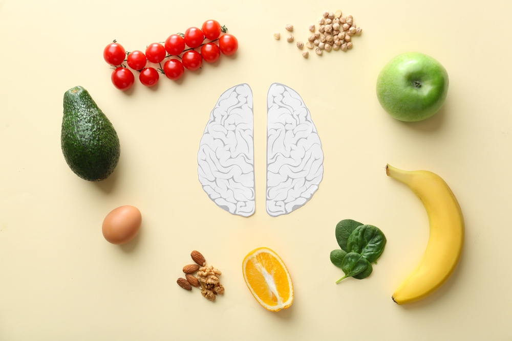 psychology behind color and appetite
Ever found yourself reaching for that bright red apple or the vibrant orange carrot? That’s no accident.
The mystery lies in the psychology of color, and it’s playing games with your taste buds. The power of a particular color in food packaging can influence consumers in ways they might not even realize.
The allure of red, the cheerfulness of yellow, and the soothing calm of green can heighten nerve impulses, making food appear more appetizing than it actually is.
These colors are not just for show. They play tricks on our taste buds, making things taste sweeter and less bitter.
A vibrant red can make strawberries🍓 taste sweeter, while a dull one can make them taste less appetizing.
It’s a clever trick played by our brains, releasing serotonin (the happy hormone), and turning the mundane act of eating into a delightful experience.
The Allure of Red in Food Marketing
Red, the ultimate appetite stimulant, steps into the spotlight. This fiery hue has a long-standing love affair with the food industry.
From fast-food chains to gourmet dining, red is the go-to color to attract consumers.
Its irresistible charm lies in its ability to signal ripe and sweet natural foods, making your brain think “Hey, I’m delicious, come get me”.
But that’s not where the magic of red ends. This bold color has a knack for enhancing the perception of sweetness.
A sip of red-colored drink can trick your taste buds into detecting a sweeter taste.
This psychological trick is widely used in the fast food industry, where red is a commonly used color to make food more appealing and tempting.
Yellow: The Happy Color for Foods
Now let’s turn to yellow. This sunny color is like a joy-spreader, boosting happiness and energy, and making you feel hungry in a good way.
It sparks feelings of joy and creativity, bringing a sense of enthusiasm, confidence, and hope.
Consider this color the life of the party in the food packaging world, especially when it comes to healthy and natural foods.
Numerous food brands effectively utilize yellow in their packaging. Some examples include:
- Lay’s chips, which have cheerful yellow packaging
- M&M’s, which have vibrant yellow packaging
- McDonald’s, Burger King, and KFC, which all use red and yellow branding for their takeaway food packaging
Yellow is a hot favorite for food packaging in the industry.
Green: The Go-To for Health and Well-being
Green, synonymous with health and well-being for a long time, is a favored choice for natural and eco-friendly food products.
As the embodiment of all things fresh, healthy, natural, organic, and vegetarian, it’s no wonder green is a symbol of health and well-being in the world of food marketing.
Green becomes a default choice in food branding, conveying a fresh, healthy, and natural vibe. You’ll find it strutting its stuff in brands related to agriculture, forestry, and farming.
And let’s not forget those natural ingredient-packed, health-boosting food products that just can’t resist a pop of green in their packaging.
White packaging, for example, can also convey a sense of purity and cleanliness, making it another popular choice for product packaging in food products.
Color Combinations That Work
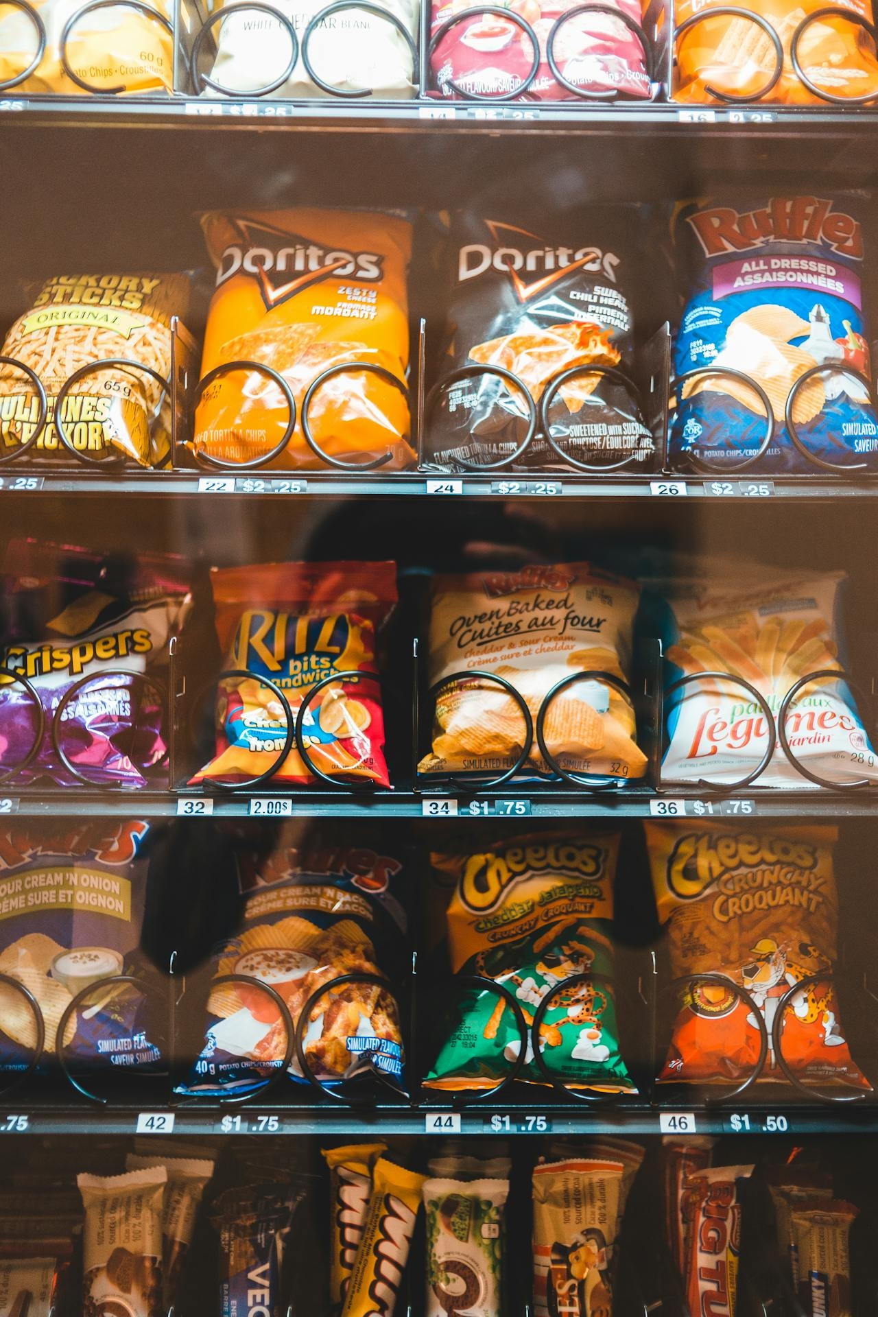 branded food packs
Apart from individual colors, clever color combinations also add a touch of magic to food packaging.
It’s like putting together an outfit; the individual pieces might look good alone, but it’s how they work together that really makes the outfit pop.
Complementary colors, the yin and yang of the color wheel, create a striking contrast that’s essential in food packaging to catch the eye of consumers and make the design pop.
Some popular complementary color combinations for food packaging include:
- Red and green
- Blue and orange
- Purple and yellow
- Pink and green
- Orange and blue
These combinations create a visually appealing and attention-grabbing effect that can make your food packaging stand out on the shelves.
Contrast and complementarity serve as secret weapons in the design of food packaging.
They add that extra oomph, drawing in the crowd.
For instance, a calming vibe for green tea packaging might rock analogous colors, while energy drink packaging might go for complementary colors to bring the party vibes, all in the name of boosting brand identity.
Take a look at Coca-Cola and Pepsi – they rock contrasting primary colors of red and blue in their packaging.
And let’s not forget the classic combo of red and yellow, which always makes food look extra appetizing.
Contrast and Complementarity
Color theory involves more than creating attractive colors; it’s about the artistic and scientific blending of them.
It’s all about finding the right mix of colors and playing with their luminance to create visual hierarchy and better readability.
This is especially important in the food industry, where colour psychology and packaging play a crucial role in attracting customers.
Color contrast in packaging designs is like the spotlight on a stage – it makes products stand out and grab consumer attention, creating a visual spectacle that’s hard to ignore.
This is particularly important for filling foods, as the packaging needs to entice consumers to choose them over other options.
Moreover, contrasting and complementary package colors work their magic by:
- Sending a clear message about the brand
- Creating a vibrant look
- Increasing the design’s readability and overall visual appeal
- Contributing to brand memorability.
Brand Identity Through Color Schemes
Colour schemes do more than just beautify; they are instrumental in building brand recognition and trust among consumers.
After all, you want your customers to feel cozy with your product, right?
If you want to give your brand an air of trustworthiness, consider using a colour scheme with shades like:
- red-based
- brown-based
- purple
- green
- blue
- orange
But what if a brand wants to jazz up its color scheme without scaring off its loyal fans?
Well, a brand can give its color scheme a makeover without losing its fanbase by being transparent about the rebranding, making small changes instead of a complete overhaul, and getting input from customers and stakeholders.
Specific Colors for Types of Food
 young lady drinking coffee and eating watermelon
Let’s now examine how specific colors impact the packaging of various food types.
The choices made can significantly impact how consumers perceive a product.
For instance, bright colors are often used for snacks and sweets, earth tones for organic and natural food products, and darker shades for luxury and gourmet items.
A particular colour can make all the difference in consumer perception.
These choices are not random; they are strategic moves aimed at appealing to specific groups of consumers.
The color used in food packaging can greatly influence the perception of the product, and the choice of a particular color can indeed make or break a product’s success.
Bright Colors for Snacks and Sweets
Bright colors, the party animals of the food packaging world, add excitement and allure to snacks and sweets.
They catch the eye, create a sense of excitement and fun, and are often used for snacks and sweets to appeal to younger consumers.
These vibrant colors also mess with our taste buds, making things taste sweeter than they actually are.
For instance, a bright red candy appears sweeter than a dull one, even if they are of the same flavor.
And it’s not just a coincidence that red and yellow, the chief food colors, are known to whet the appetite.
So, next time you find yourself reaching for that brightly colored candy, remember, it’s all in the colors.
Earth Tones for Organic and Natural Food Products
At the other end of the spectrum lie earth tones such as green and brown.
These colors give off a vibe of freshness, healthiness, and natural goodness, making them ideal for organic and natural food products.
It’s like bringing a piece of nature to your pantry.
Brands related to agriculture, forestry, and farming, as well as health-boosting food products packed with natural ingredients, often use these colors in their packaging.
It’s the perfect way to convey the message of naturalness and sustainability to consumers.
But it’s not just about greens and browns.
Darker Shades for Luxury and Gourmet Items
Luxury and sophistication are radiated by darker shades such as black and deep green.
They are like the fancy tuxedo of the packaging world, making them suitable for gourmet and high-end food items.
The color black is all about high-end vibe, while brown is more appetizing.
Darker blues and blacks are the go-to colors for high-end food packaging, giving off an air of sophistication, opulence, and excellence.
These colors make consumers feel posh and sophisticated about the brand, making them think they’re getting something really special.
So, next time you see a food product in darker packaging, remember, it’s not just about the color; it’s about the experience it offers.
Cultural Perceptions and Colour Choices
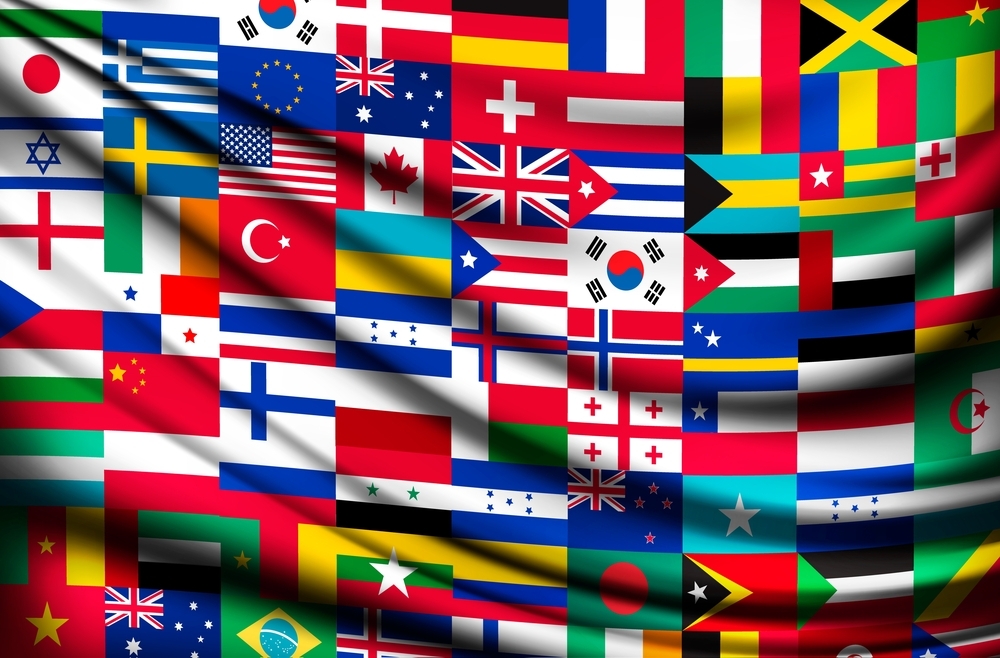 world country flags
Although color psychology significantly impacts food packaging, the influence of cultural perceptions and regional color associations cannot be overlooked.
After all, color preferences and symbolism can really sway consumer behavior and affect sales.
It’s a big deal how color influences consumers.
Regional Color Associations
Regional color associations significantly sway color choices in food packaging.
For example, in Asian cultures, red is all about luck, joy, and celebration, so it’s often used to reel in customers, especially during festivities.
Meanwhile, in Middle Eastern countries, the color red is like the love potion of Arab culture, used to stir up some passion and love in food packaging designs.
In Europe, people dig both the cool and the warm colors for their food packaging. Meanwhile, in Africa, they go for bold colors like red and yellow to get those appetites going.
They’re all about earthy or vibrant colors, with red for passion and energy, and blue for various meanings.
Adapting to Market Preferences
Adaptation to market preferences becomes another key determinant in the selection of appropriate packaging colors.
By understanding the cultural background and preferences of the target market, businesses can create packaging that resonates with consumers and meets their expectations.
For example, there’s a North American fast-food chain that revamped its packaging to suit various markets, and some brands in China are rocking vibrant colors to attract local consumers.
So, understanding and adapting to market preferences can greatly influence color choices in food packaging.
Designing with the Consumer in Mind
 food takeaway pack
In the realm of food packaging design, the consumer reigns supreme.
Knowing your audience and gathering feedback💬 are crucial in creating packaging that resonates with consumers.
After all, the packaging is designed to attract and entice them to choose your product over others.
Knowing Your Audience
Knowing your target audience is the first step in the design process.
This involves conducting market research and analyzing audience demographics, interests, and buying history.
By understanding the target audience’s preferences, businesses can create packaging designs that appeal to them.
Age, gender, and socio-economic status can really throw a curveball into what colors people prefer on food packaging.
People’s attitudes, attractiveness to colors, and norms all come into play, and it’s a whole different ballgame for different demographic groups.
Testing and Feedback
Businesses can refine their packaging to resonate with their target market by testing designs and collecting feedback.
Feedback can be collected through online surveys, focus groups, and targeted testing.
This feedback helps identify what consumers love and what needs a little sprucing up.
Color is the real MVP in packaging design feedback. It has the power to sway consumer behavior, stir up emotions, and make brands unforgettable.
Plus, clever color combos can make a product pop and demand attention. It’s like the first impression that really counts.
Trends in Food Packaging Colors
Food packaging color trends are in a state of constant evolution.
They are influenced by various factors, including innovations in packaging materials and design techniques, as well as predictions for future consumer preferences.
Innovations Leading the Way
Blazing the trail for new trends in food packaging colors are innovations in packaging materials and design techniques.
Cutting-edge packaging materials are shaking up the color game by taking into account how colors sway consumer behavior and perception.
The hot favorites in food packaging color trends right now are all about rocking monochromatic schemes, popping with bold and vibrant colors, and going big and bold to make products steal the show on the shelf.
These innovative materials help create eye-catching designs that set products apart from the crowd.
Summary
In conclusion, the color palette in food packaging is a complex interplay of psychology, cultural associations, and market trends.
Every color, from the fiery red to the calm green, plays a unique role in influencing our food choices.
As food brands continue to innovate and adapt to changing consumer preferences, the world of food packaging colors keeps evolving.
So, the next time you pick up a food product, take a moment to appreciate the colors on its packaging. After all, a lot of thought, research, and creativity went into choosing them.
Frequently Asked Questions
What colors are best for food products?
The best colors for food products are warm colors like red, orange, and yellow. These colors are known to stimulate appetite and are often used for food branding.
What colour is best for packaging?
For packaging that builds trust, go for blue. If you’re aiming for a cheerful image, consider using a mix of very light, warm colors like red and yellow.
What is the color code on food packaging?
The color code on food packaging uses red, amber, and green to indicate high, medium, or low levels of fat, saturates, sugars, and salt. Red means high, amber means medium, and green means low. So, keep an eye out for these colors to make healthier choices!
Why is color important in food packaging?
Color is crucial in food packaging because it can evoke specific emotions and convey messages to consumers. Packaging professionals must carefully consider the emotions and meanings associated with different colors to ensure the product’s message is effectively communicated. Remember, color meanings evolve over time!
Why are red and yellow commonly used in food packaging?
Red and yellow are commonly used in food packaging because they are known to stimulate appetite, making them popular choices for grabbing your attention and making you hungry.

