Best Colours for Takeaway Packaging to Boost Your Food Business
By Anttoni Taimela · 4. June 2024
Choosing the best colours for takeaway packaging can transform how customers perceive and interact with your food brand.
This guide strips down the fluff and zeroes in on the shades that entice appetites and communicate your brand’s essence—without revealing too much, be prepared to uncover the colour strategies that top industry players use to win over diners’ hearts and stomachs. 🍽️
Choosing the Right Palette for Takeaway Success
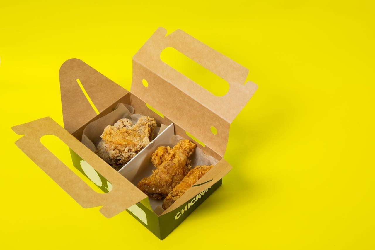
 Box with takeaway food on yellow surface
Illustration of various takeaway packaging in different colour schemes
Colour, that silent salesman, can be your best bet in the bustling bazaar of takeaway food. With colour psychology playing a pivotal role in consumer behaviour and brand recognition, it’s no small fry matter.
Imagine, a whopping over 90% of snap judgments made about products can be based on colour alone.
That’s right, before a single fry is savoured, or a sip of soda is slurped, the colour of your takeaway packaging might have already sealed the deal.
So, if you want your nosh to be the popular choice, picking your palette isn’t just about aesthetics—it’s about appetites.
Approach the colourful domain of food branding with caution, as each shade carries a significant impact on our brain’s visual processing powerhouse, the cerebral cortex.
From the fiery appetite-awakening reds to the tranquil blues that might just put your hunger to bed, colours are the true heavyweights in the ring of consumer perception.
But, before you start painting the town, let’s break it down colour by colour.
The Power of Red in Fast Food Chains 🔴
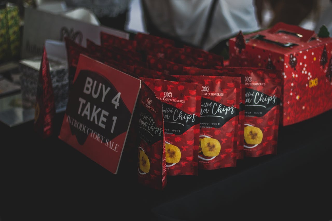
 branded food packaging
The crimson craze is no stranger to the food industry, where red packaging is not just a choice, it’s a strategic chess move for food brands looking to checkmate the competition.
This colour of passion and hunger has been the wingman of fast food chains, sparking a sense of excitement that’s hard to ignore.
Ever notice the unmistakable red of a Coca-Cola can, or the bold backdrop of a KFC bucket? That’s red doing its job, and doing it well, as these brands leverage its vivid virtues to stand out in a crowded market.
Yellow: The Colour of Happiness and Hunger 🟡
Next, we shift our focus to yellow, a colour that brings a ray of sunshine to the realm of colour psychology.
This cheerful chap is not just a pretty face; it’s a psychological powerhouse when it comes to stirring up hunger pangs.
Imagine the golden arches of a certain fast-food giant; yellow isn’t just a branding choice—it’s a colour cautiously selected for its ability to evoke happiness and, more importantly, an insatiable appetite.
Therefore, for those embarking on a new food venture, incorporating some yellow into your packaging could stimulate both the visual appeal and hunger of your prospective customers, helping to attract consumers.
Green: Signifying Health and Eco-Friendliness 🌿
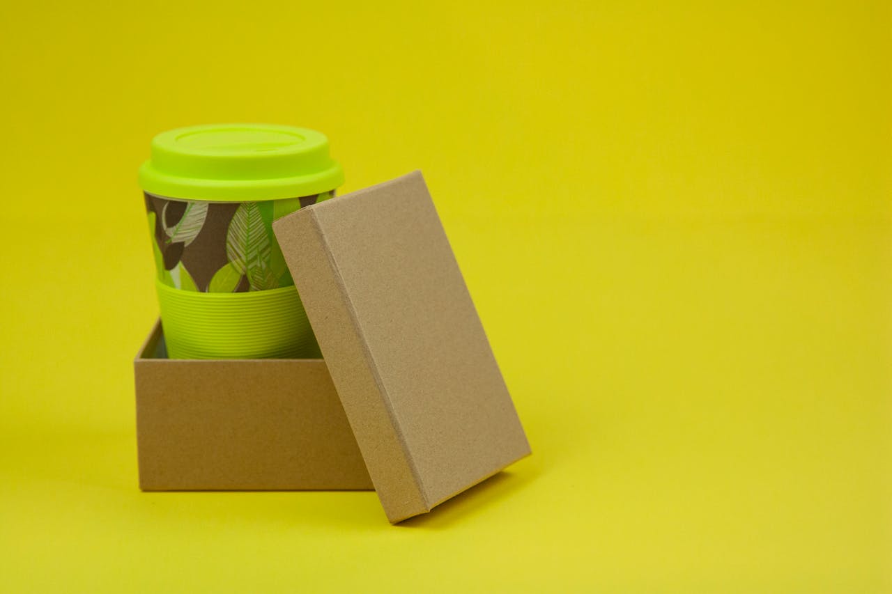
 Paper cup in cardboard box
Green is the gallant guardian of all things fresh and healthy in the takeaway food scene. It’s the colour that whispers “good health” to consumers, offering a salad of eco-friendliness and nutritional virtue with every glance.
Organic food brands have fallen head over heels for this hue, with brands like Subway and Starbucks flaunting their green garb as a badge of honour for their environmentally friendly products.
When consumers spy this colour, they not only see a product that promises quality and freshness, but they also feel a sense of doing right by Mother Nature.
The Psychology Behind Colour Choices 🧠
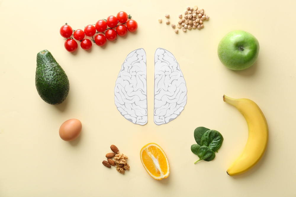
 psychology behind color and appetite
Now, we shall delve deeper into the complex world of colour psychology, where various shades significantly influence our emotions and taste buds.
This isn’t some newfangled notion; colour psychology is as old as the hills, studying the spectrum of effects from mood swings to munchies.
It’s a world where different colours can be the puppeteers of our emotions: red evokes love and passion, while blue coaxes forth calmness and serenity.
Moreover, it’s not only about the emotional impact; it’s also about the energy each colour brings.
Bright colours are like a double shot of espresso for your brain, while the softer shades are the cool chamomile tea that soothes the soul.
And if you think this is all just modern mumbo jumbo, think again! The ancients were onto this with practices like chromotherapy and chakra balancing, linking colours to the very energy pools within our bodies.
How Colours Influence Appetite 🍔
However, we can’t overlook the central role of appetite in the world of takeaway packaging.
Have you ever wondered why some colours make you want to gobble up everything in sight, while others leave you feeling like you’ve just had a full meal?
That’s colour psychology at its finest. It turns out that blue, the cool kid on the block, can actually put the brakes on your hunger, serving up a chill pill that suppresses the appetite.
Colour Associations with Taste Perception 🎨
Next, we examine the fascinating relationship between colour and taste perception. It’s a sensory spectacle where colour takes the lead role in setting the stage for our gustatory expectations.
The brain, that clever conductor, orchestrates our food experiences based on a lifetime of colourful encounters, preparing us for what’s to come when we lay eyes on our lunch.
But what happens when the script is flipped, and the colours on our plate don’t match the flavors in our minds?
The brain pulls a Houdini, magically adjusting our taste perceptions to keep the narrative consistent.
Food brands know this all too well and employ spectrophotometric wizardry to ensure that the colours of their products and packaging hit the right notes of consumer expectations.
Packaging Design That Attracts and Sells 🛍️
Picture yourself in the aisle, scanning from one product to another—the product packaging design often influences your purchasing decision.
In the culinary coliseum, where choices abound, an effective package design is like a mighty magnet, drawing in the right crowd and bolstering your business’s bottom line.
But it’s not just about catching the eye; it’s about encapsulating the essence of your brand, creating a visual voice that sings in harmony with your marketing melody.
Indeed, if your packaging promises something, your product must deliver.
That’s where prototyping plays an essential role—to align the presentation with the taste.
Balancing Aesthetics and Brand Message 🎨
The delicate interplay between aesthetics and brand message requires every detail of the design to align with the brand’s identity.
Clear, no-nonsense packaging designs are like a firm handshake—they build trust with consumers who can quickly grasp what the product is and what the company is all about.
But before you take the stage, you’ll need to know your audience inside and out. Tailoring your packaging to the tastes and values of your target audience is not just one aspect of the process; it’s an integral part of the branding ballet.
Strategic Use of Colour Contrasts and Combinations 🎨
Next, we explore the strategic harmony created by colour contrasts and combinations.
It’s a visual concerto where warm colours like reds and oranges are the vibrant violins that stir up feelings of energy and happiness.
On the flip side, the cool blues and greens are the cellos, providing a calming backdrop that soothes and settles.
And let’s not forget the playful orange, often seen frolicking in food packaging, inviting consumers with open arms to a brand that’s all about fun and friendliness.
It’s a colourful feast for the eyes that, when done right, can turn a simple packaging design into a striking brand statement.
Maximising Impact with Minimalist Designs 🟦⬜
Minimalism, the practice of conveying more with less, has become a prominent trend in packaging design.
It’s a trend that embraces the beauty of brevity, often using a canvas of white to convey a message of simplicity, safety, and tradition.
In a world that’s often cluttered with noise and excess, minimalist packaging is a breath of fresh air, a design philosophy that uses fewer colours, less text, minimal iconography apart from the brand logo.
The Elegance of White and Negative Space ⚪
White, the colour of purity and sophistication, is the beating heart of minimalist design. It’s the blank canvas that draws people in, offering a sense of cleanliness and simplicity that’s hard to resist.
Studies have shown that the strategic use of white space can amplify legibility, allowing key messages like logos to stand out in bold relief.
And when paired with the occasional pop of colour, white packaging can transform from simple to simply stunning, offering a hint of tradition with a modern twist.
Dark Colours for a Premium Feel ⚫✨
However, we must also acknowledge the appeal of darker colours.
Dark colours, especially black, have always been a symbol of luxury and exclusivity, a go-to for high-end products looking to ooze class and elegance.
The use of black in packaging design is like slipping into a little black dress, instantly elevating the product’s stature and screaming premium quality.
And when you throw in a dash of gold or silver, you’ve got a packaging design that’s not just premium—it’s practically regal.
Innovations in Sustainable Packaging Colours 🌿
As the green revolution forges ahead, the colour of your packaging extends beyond aesthetics—it represents ethical considerations as well.
Brands like Starbucks are leading the charge, painting their commitment to sustainability in bold strokes of green.
It’s a trend that’s gaining steam across the food industry, where the colour of your takeaway packaging speaks volumes about your respect for our planet.
Innovators like Evocative Design and Carlsberg are thinking outside the cardboard box, turning to materials like mushrooms and special glues to give their packaging an eco-friendly edge.
It’s a move that not only captures the hearts of environmentally-conscious consumers but also sets a new standard for what it means to be an eco-friendly brand in the food space.
Biodegradable Materials and Natural Hues 🌱
Utilising biodegradable materials and natural colours in their fight against waste, brands are packaging their products in colours that reflect their conscience.
Take Pangea Organics, for instance, a trailblazer with 100% compostable packaging that transforms into a green garden right before your eyes.
And then there’s Puma’s Clever Little Bag, which has slashed the use of cardboard by 65%, proving that sometimes less is indeed more when it comes to sustainable solutions.
These brands are painting a picture of purity and responsibility, one package at a time, using the palette of the planet to colour their cause.
Summary
So, there you have it—a kaleidoscope of colours that can turn your food branding from bland to grand.
Whether it’s the fiery reds igniting our appetites, the joyous yellows brightening our moods, the serene greens soothing our eco-consciences, or the luxurious blacks hinting at premium delights, the rainbow of possibilities is as vast as it is vibrant.
Embrace the power of colour in your takeaway packaging, and watch as your food business becomes a feast for the eyes—and the bottom line.
Frequently Asked Questions ❓
What impact does the colour red have on my food packaging?
Red packaging can draw attention and increase appetite, making customers more likely to choose your product over others.
Can colours in packaging really influence how consumers perceive taste?
Yes, colours in packaging can definitely influence how consumers perceive taste. It’s all about setting the right expectations for their taste buds.
How does minimalist packaging design impact consumer perception?
Minimalist packaging design impacts consumer perception by conveying cleanliness, purity, and simplicity, suggesting sophistication and quality, making the product appear more luxurious and desirable.
Why are eco-friendly brands using green in their packaging?
Eco-friendly brands use green in their packaging because it symbolises health, freshness, and a commitment to environmental responsibility, serving as a visual cue for consumers who value sustainability.
How are colours strategically used in food packaging to attract customers?
Food packaging uses colours strategically based on the emotions they evoke. Warm colours like red and yellow can stimulate appetite, while cooler colours like blue and green convey a sense of healthiness and calmness.

