RGB, Pantone & CMYK – How to use it in your design
By Steffen Andersen · 14. May 2020
When starting on a printing project it is important to ensure that the colours printed will be aligned with the rest of your brand.
This means that the colours on your website are the same as on your paper cups, flyers and business cards.
We often experience that customers do not know the importance of it, and rarely happens that they know how to make sure the colours match each other.
In this post, we will go through the three different colour systems; CMYK, RGB🔴🟢🔵 and PMS (Pantone colours).
We will, in the end, talk about how to use the colours systems to your advantage, how to ensure that your brand is the same no matter what.
RGB / Hexadecimal colour process
The RGB colour process is in contrast to CMYK and Pantone colours, because the RGB system is used to display colours on monitors and TVs whereas CMYK and Pantone colours are used for printing materials.
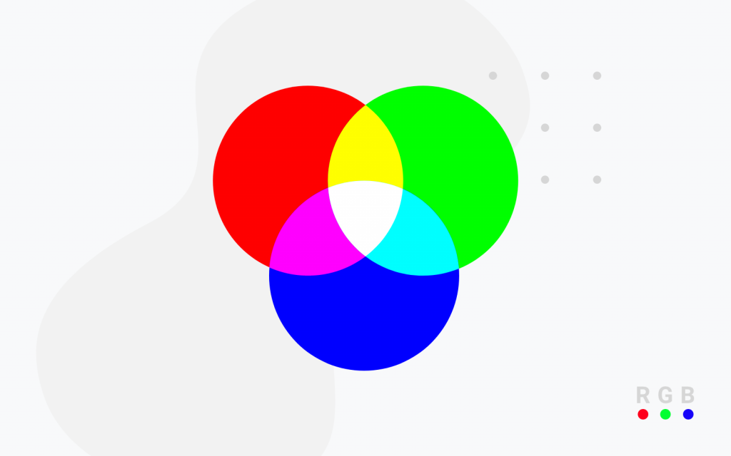
The colour process is called RGB because of the colours mixed are Red, Green, and Blue.
RGB colours can also be called hexadecimal colour or in short hex-colours, but there is a small difference.
The difference is how you choose the colours in your design system, with hex colours you would write it with # and then some numbers and letter as an example for a red colour the code would be #FF5B33.
If you use RGB instead you would write it as three numbers, the RGB number for the same red colour would be 255, 91, 51.

How does RGB work?
RGB stands for Red, Green, and Blue and the light source in the device used for displaying the elements can create any colour you need to have displayed by mixing red, green and blue.
The colour that is displayed will vary depending on the intensity of the colours used. This way of making the colours is known as additive mixing.
You make the wished colour by adding the red, green and blue light on top of black darkness to create the perfect pigment.
The more colours you add on top each other the more bright colours you will get.
So if no colours are added the colour will be black, but if all colours are added with an equal intensity you will get a pure white colour.
As stated before RGB colours are used when making graphics for website or elements displayed in videos.
This is the only colour processing system for displaying videos/pictures and etc. on your monitor, tv or mobile.
Advantages and disadvantages of RGB
With RGB colours you can create all colours that you wish, so how specific the colours are displayed and the amount of colours displayed in a picture depends on the quality of your monitor and the resolution the file was saved in.
Working with RGB colours are the perfect way to start working with design and developing graphic elements.
The only thing you have to remember is that CMYK colours can not show as specific colours as the RGB colour system.
CMYK / full-colour print / 4-colour process
The reason why it is called CMYK colours is that CMYK stands for Cyan, Magenta, Yellow, and Key/Black.
The name actually just represents 4 colours that can be mixed into a variety of different colour, this is also the reason for the name 4-colour process.
The printing process is also referred to as full-colour printing process, because you are able to choose as many colours in the design as you want without any extra cost.
We will go into more depth about this later on.

How does CMYK work?
How does the process then work? The process works by adding a layer of one colour at a time, to at the end created the colour that you wish.
The ink is often added in multiple runs to ensure that there is not added too much ink because if you use to much ink the page will ultimately get black.
This is due to colours being subtractive, so when you add a new colour it reduces the colour you added first.
CMYK-colours is the most used printing method for flyers, business cards and magazines. All commercial printers and printers you have at home use the 4-colour printing process.
The CMYK colour printing process in widely used for printing on paper packaging, but not plastic packaging as an example.
Advantages and disadvantages of CMYK
What are the benefits and disadvantages of using CMYK colour in the printing process?
As mentioned before the primary advantage and reason why magazines are printed with CMYK colours is that you can print as many colours in the design without having to pay extra for each extra one you use.
The primary disadvantage of CMYK colours is that it can create fewer colours than for example PMS and RGB, and the colours that it can print are not as specific.
So if you are looking to use a specific colour you should rather use the Pantone colour systems.
If you, for example, hear that a company has taken the patent of the colour, then it would be a Pantone colour, and not a CMYK colour.
Pantone (PMS)
PMS actually stands for Pantone Matching System, this is a colour space created by the Pantone company.
The system is made for making it easier to find the specific colour that a company wants to have printed on their products. The Pantone Matching Systems are often printed in colour-matching books.

How does PMS work?
The Pantone Matching System consists of 1867 colours for printing in total, which also includes the shades of black and white.
Since the Pantone system consists of specific colours, and that is the primary objective of the system, the printing process is completely different from CMYK colours.
When printing with Pantone colours, the specific colour will be added the specific place in the design where this colour was intended to be.
The colours will therefore not be mixed with each other as it does with CMYK colours.
Most printing companies using Pantone colours can only use up to 5-6 colours in the design, but the number of colours in the design can be more or fewer.
The primary use of Pantone colours is printing on packaging and transport vehicles.
It is especially used for plastic packaging and food packaging, the reason for plastic packaging is because it is difficult to print on plastic, and due the Pantone colours being more specific which ensures a higher quality of the print.
Advantages and disadvantages of PMS
One of the main advantages of using Pantone is when you need to have something printed is accuracy in the colour, the Pantone colour have a lot more shades than the CMYK system, and especially when it comes to orange and green colours.
This means that if you use some very specific shades of orange and green with your RGB colours, the only way to match them on printed items would be with Pantone colours.
Since the colours are not mixed the lines and elements in the design will be more clear.
The main disadvantage of using Pantone colours in the print is that, each extra colour you use in the design will add cost since the colours are added separately.
The cost can increase if you need to have 6 colours in the design instead of 2 as an example.
How to make sure the colours are the same no matter where they are shown?
Now that we know a bit about all the different colour systems then lets dig into how we can make sure that no matter where your brand and story are shown, that the customer sees the same colours.
The first thing we have to remember is that since the RGB and CMYK colours spaces are created unequal. This means that picking an RGB colour does not equal that you can get it as a CMYK colour.
This is especially the case when it comes to very bright colours, that cannot be converted from RGB to CMYK.
The Pantone colours will almost always be available in the colour you have chosen as your RGB colour, since the system was developed to match the RGB colours on the print.
The primary thing you have to check then is if the RGB or Pantone colour matches a CMYK colour.
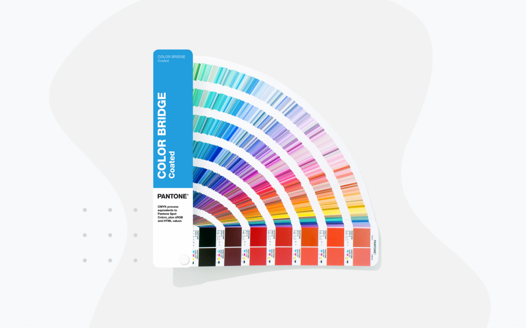
You can check it in two different ways – You can either do it with the Pantone Colour Bridge swatch guides I mentioned before, these guides you can both find online or get one of them by asking your local printing agency.
The Pantone Colour Bridge swatch guide will on one side show the Pantone colour and on the other side show the equivalent CMYK colour.
The other way you can do it, and maybe a bit easier if you have asses to a design program like Adobe Illustrator or Adobe Indesign.
You can check if the colours are available in the different colour spaces in your design program, I would recommend checking this guide from 99desings on how to do it.

