Pictures in the design: Opportunities with CMYK print
By Steffen Andersen · 7. February 2022
The design of the paper cups can be made in many different ways – and they can be printed with a lot of different colours, elements and also pictures.
In the following article we will talk about why and how you can use pictures in your paper cup designs – we have also added some examples of what different companies have done.
There are multiple ways to use pictures in the design, but we have sorted them into three categories which are the ways that we mostly see how pictures are used in the design.
We have split up the categories in; using the pictures as the main objective, using the picture as the background and using pictures as elements in the design.
I don’t have a specific recommendation on which approach is the best – I would say that it depends on the situation.
I think if you are going to a fair to promote a product, then the first approach is primarily used for this and also the one I would recommend.
But if you are a café or a shop offering coffee, then I would choose between the two other approaches because they are more versatile. They both have the possibility to create a great looking background, but it of course also depends on the picture/pictures available.
But let’s dig into the first category of pictures printed on paper cups, and then I will talk a bit more about them below.
Using pictures as the main objective
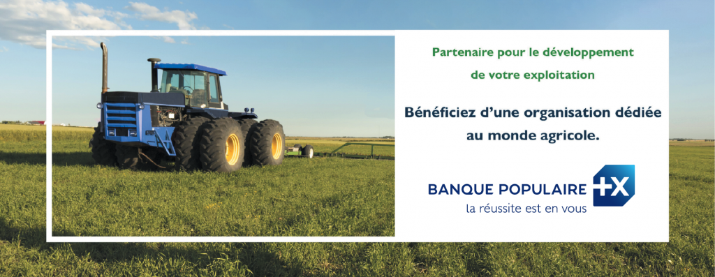
If you are considering using a picture as the main objective in the design, then I think you should only do so if you are selling a physical product.
But if you have a physical product and at the same time, it is a great way to show how the product looks and its functionality, then it is just a win-win.
When you are making a design where the main objective is the picture, it doesn’t mean that you can add anything else.
You as an example add some text that describes the product or some of the slogans that you would like to promote with the product.
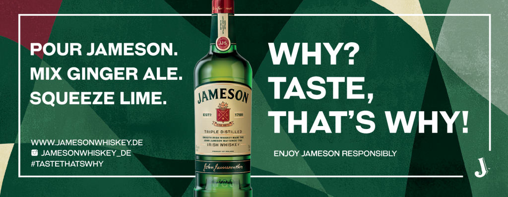
As you can see in the second example from Jameson Whiskey, they also have another background for the cup than the picture.
They have just made sure to use contrast colours🎨, so you can easily see the bottle of whiskey is what they want you to have a look at.
Banque Populaire
Jameson Whiskey
Using pictures as the background
If you are looking to use pictures in your designs, then using it as the background can be a really good idea if you want to put the focus on something else in the design.
The picture in the background can be a great way to show what you are offering and creating a relevant background.
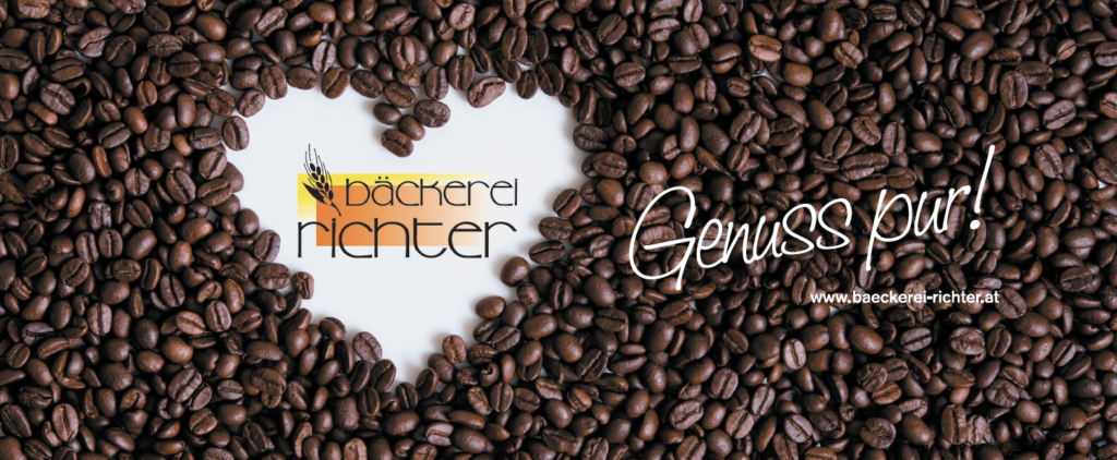
The design examples that we wanted to show down below, are using pictures as the background to make the logo the main thing for the customers to notice.
But I think that the background just adds to their logo purposes and this makes it even easier for the customer to spot the logo – just as they would like it.
EDS hair

Bäckerei Richter
Using pictures as elements in the design
It can be a really good idea to use elements in your design to enhance the message, and if you have pictures that are relevant to this, then it’s only a bonus for you.
When you are adding the pictures as elements, they are still primarily a part of the background – but they will give your design an advantage since not many others do this.
In the examples below we actually have two different approaches to using pictures as the elements.
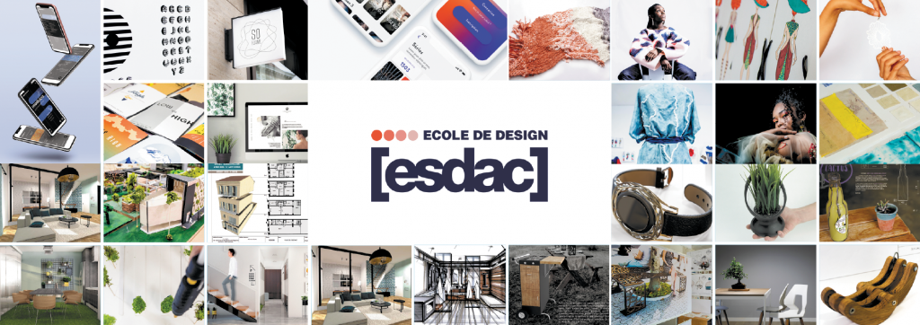
Where the first approach is focusing on showing as many of the products as possible, to let you know what they are capable of doing and what they can offer.
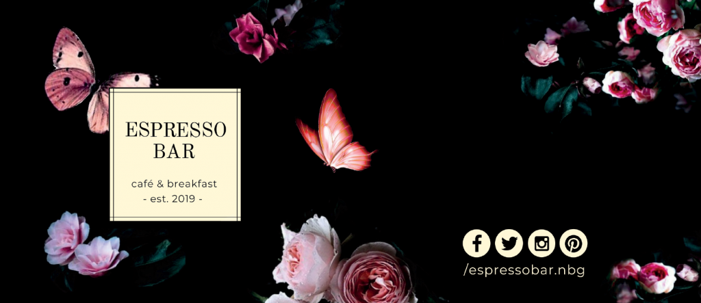
The second approach is a café that wants to give their customers the same feeling as when they step into the shop.
They have done that by adding pictures of the flowers in the backgrounds, but still kept the background in dark colours – and then they have their logo in a more bright colour so it is easy to spot.
Let’s have a look at the two examples of the printed paper cup designs!
Ecole de design
Espresso Bar
