How to use elements in your paper cup design
By Steffen Andersen · 22. January 2022
Symbols, elements, smileys, figures and pictures, success has many fathers. But using some of these in your paper cup design can be an “easy” way to take your paper cup design to the next level.
In this article we are going to go through some examples of how you can use elements and figures when designing your paper cups!
The primary reason companies choose this approach is because they are trying to seek new ways to differentiate their design.
I agree with them, that it is a great path to choose when wanting to stand out in the crowd, but also because you (in many of the cases) also use elements that represent your business.
There are multiple ways to use figures and elements in your designs! We have tried to collect different types of paper cup designs to represent as many approaches as possible.
This has resulted in five categories, where some of them are completely different and some might look a bit more similar – but with a twist.
I will explain briefly in each of the categories why that specific design approach can be good for you, and what you have to have in mind when designing accordingly.
However, it is important to have in mind that using elements is not always an advantage since it could take the focus from other more important parts of the design.
Designs with many elements
In the first category, I am going to show you the more creative designs amongst the categories.
This is also the category where you could do more harm than good when using elements in your design – if you use too many elements, then the person looking at it could have a hard time figuring out what to observe and what to not observe!
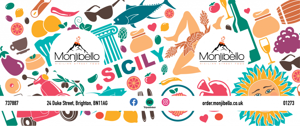
The feeling you will get from the two designs down below is completely different, you will see how the elements have made the designs even more individualised in a great way.
But what does it then mean that it is more individualised?
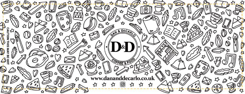
The design from Dan & DeCarlo shows exactly what I mean – they have used both emojis/elements that illustrate what they serve in their coffee shop.
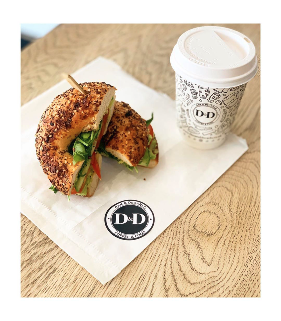
When looking at the paper cups, you can see both their logo and what they are offering.
I also like that the elements are somehow floating towards the logo, it looks like everything is moving towards the centre which leads your eyes to the logo!
Dan & DeCarlo
Monjibello
Design elements blending into the background
This category of designs is a bit different. In this category, the elements are not the focus point, but they are forming the background.
The designs that we are going to show you have chosen different approaches to this – where some of them have faded the elements so they actually are in the background.
The two other designs are using the elements to lead your attention to the logo, so they are elements that you look at – but at the same time they are pulling your attention towards something else, the logo.
The cool thing about the paper cups is that you can use both kinds of designs, since it is really easy to print faded colours when using CMYK-colours.
Carebox24
The DOOR
Badisch Mokka
Designs without a logo
In this category we will have a look at how you can make your paper cup design without a logo involved – but how you still can make the design so the customers are reminded of you when they see the design.
In general I understand the skepticism against paper cups without a logo, because it is a cheat code, where you can add this to your packaging and people will instantly remember that it is yours.
But you can create this same cheat code by using colours, elements and other figures constantly in your designs.
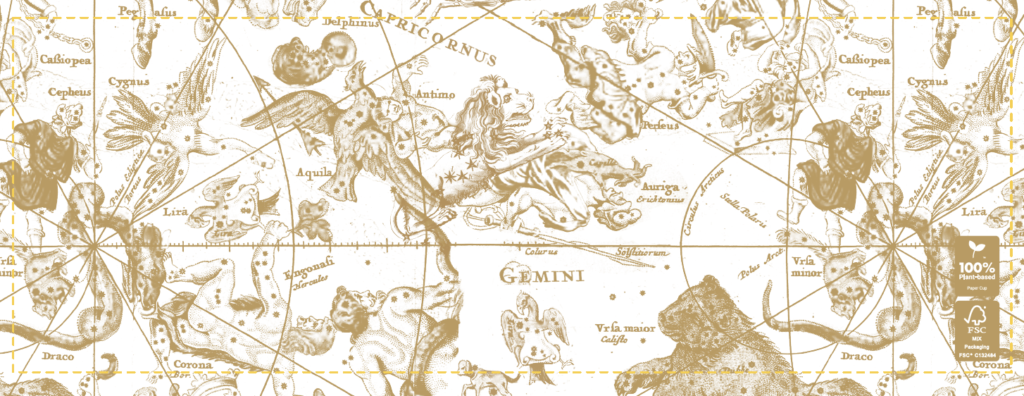
The first of the designs that we have shown below is focusing on aspects of the experience that you have at their shop, with showing elements of food and drinks that you can get in the shop and to go.
The second design is not so much about creating a recognisable design that is in alignment with the rest of their designs – but it is a clothing brand who are trying to make a design that the customers can see themselves in.
HGI
Sezane
Simple design with few elements
When I was writing this article I promised my colleague Erik (our designer), to include this category because it is his favorite design style.
I, myself, am a bigger fan of the complex and illustrative designs – but enough about that, let’s get back to the category of simple designs. The first thing to answer is, why does Erik love this design style so much?
It is simple, because you cannot mistake the message and what you should see on these cups. And actually more importantly, you are sure to use fewer colours and elements that will make the designs easier to recognise.
Last but not least when you use less elements, colours, and etc. it also makes you focus on the most important parts of your brand.
Well enough about why this design style is great and so many choose to use it(other than Erik, trying to push most designs in this direction).
Let’s have a look at the designs that we have chosen to represent this category.
Pretty Polished
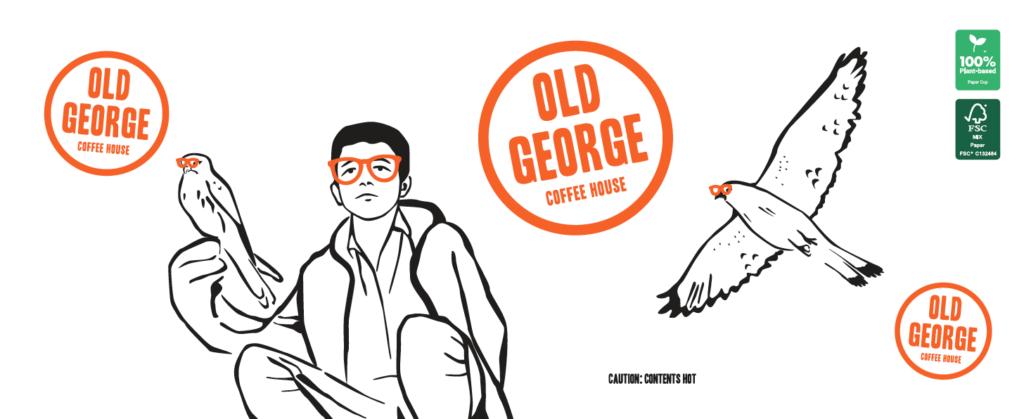
Old George Coffee
Simple design with many elements
I think in general there is the perception that a simple design means a design with as few things in the design as possible – and in that regard ending up making them not look very colourful.
I have added this category to prove this perception wrong, because I actually believe that they can be made to fit perfectly with each other.
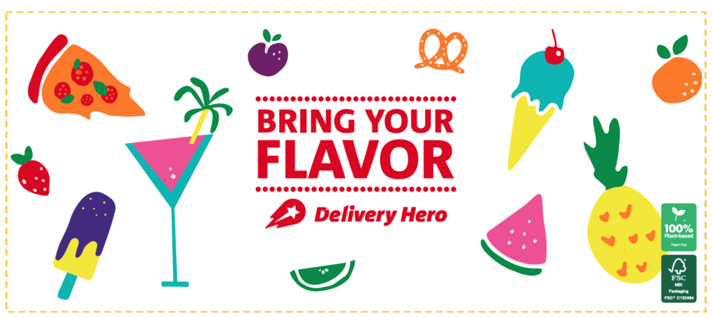
I have added three designs below, where two of them are rather colourful and the last is in the same colour but where the elements are rather illustrative.
I have repeatedly said this during all of this article but to create a great design, you need to use the same colours or/and elements consequently across all of your platforms.
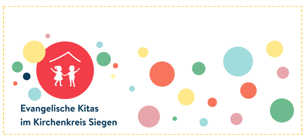
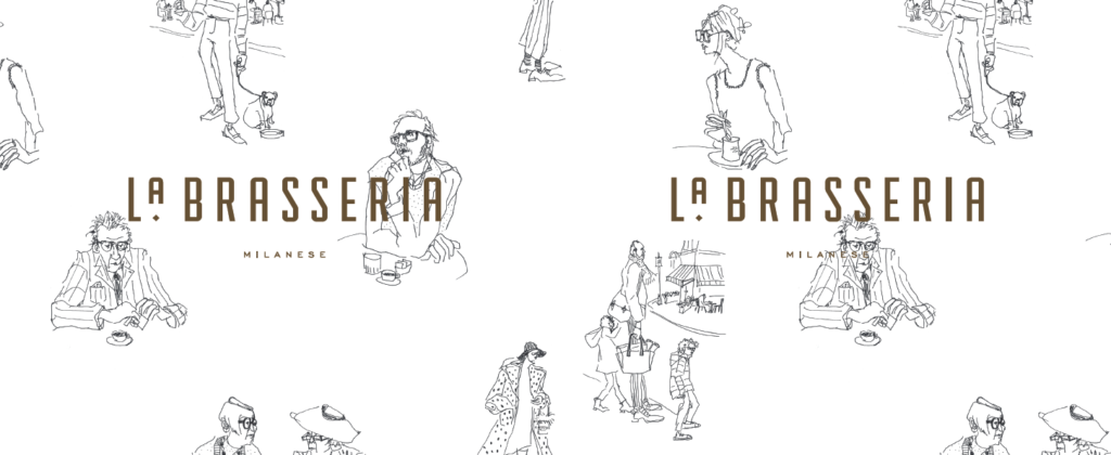
So the thing that makes these designs great is that they are consequent in their approach; first designs are using circles in colours, the next designs are using people that are drawn and looking at the logo, and the third design has food and the colours in the elements are melting.
I am a very big fan of the designs – Let’s have a look at them below!
Evangelische Kitas
La Brasseria
Delivery Hero
