74 Fabulous Paper Cup Designs
By Laura Gravesen · 25. May 2021
Our Paper Cups
Paper cups can be used in a lot of different scenarios, they are not only used by cafes, hotels and restaurants – but also by companies having events, going to fairs and so on.
We have helped a lot of different types of companies with paper cups for different purposes.
We have collected a few of the different designs we have made and we would like to share them with you.
We have splitted them into categories representing the most popular design layouts so you can get inspiration from the one closest to your ideal cups.
The collection of designs (below) have been picked out from over 5000 paper cup designs we have made in 2020.
The design below actually contains 74 different designs of paper cups – I am sure that this will help you to get inspiration for your paper cup design.
I will let you scroll through the designs and categories now – I have just made some small comments about why each category is commonly used and why the type of designing is cool. Happy reading!
Standard Paper Cups
The majority of the paper cups that we produce are made with the two versions of our standard paper cup designs.
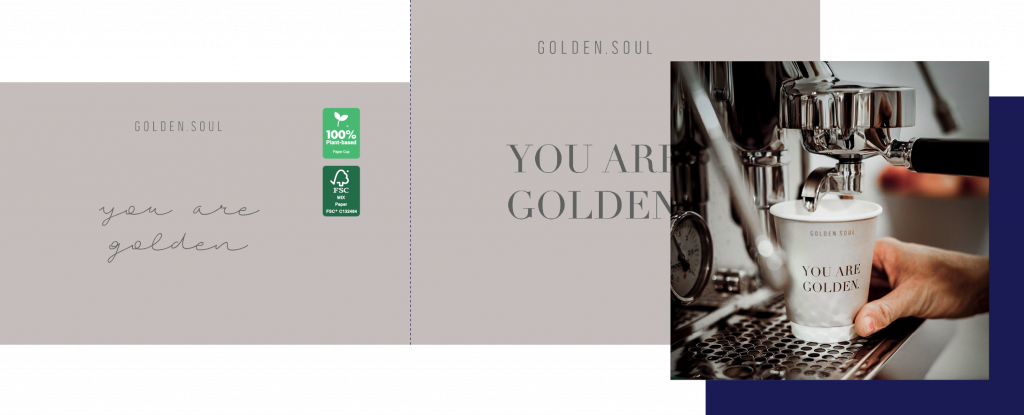
This is either customers who choose to get their logo on two sides of the cup or just the logo on one side of the cup and then some information on the other side.
Some of these standard paper cup designs also include information such as the shop’s address, social media or phone number in the design.
This means that there are primarily two ways the designs differ from one another; obviously the logo – and the second one is the background colour.
Logo On Both Sides
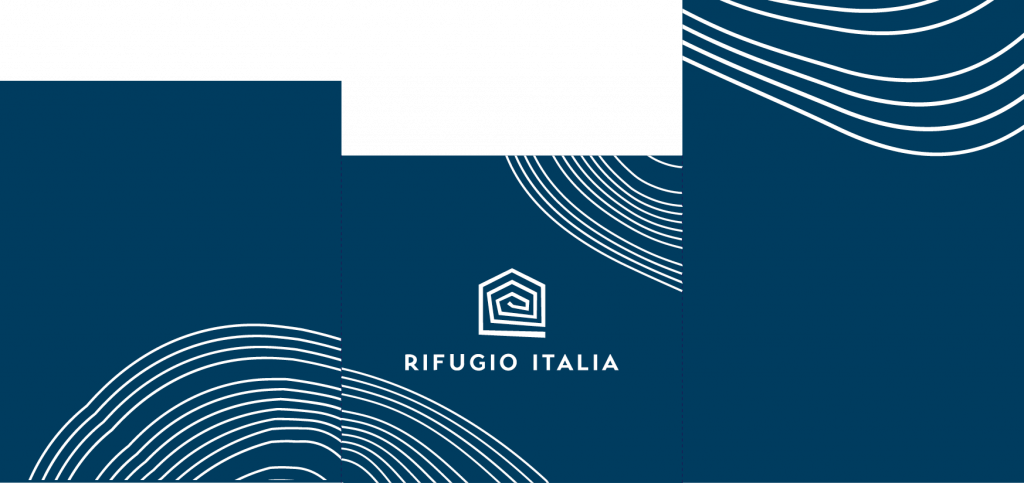
The first category of the standard paper cup designs are where they have a logo on both sides of the cup – the reason why we have chosen the designs below has to do with the background colour chosen that fits very well with the customers logos and design styles.
These designs not only contain their logos and a background colour, but some of them also have a text under their logo or on one of the sides.
No more talk from me, let’s dig in and see the first category.

Logo On One Side
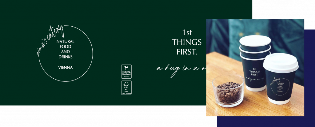
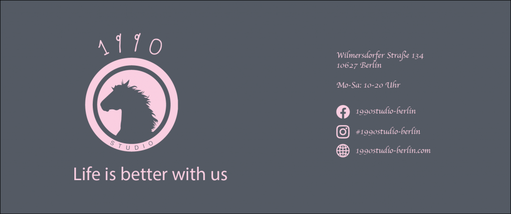
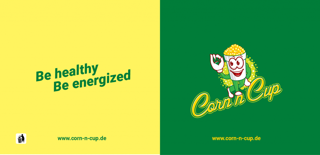
The second category of the standard paper cup designs are where they have a logo on one side of the cup and either a quote, text or some kind of other information on the other side.
The information is in most instances their social media information: An effective way to inform the customers what they should tag when posting pictures of their cups on Instagram and other platforms.
That is actually a pretty clever strategy to get their brand name shared.
No more talk from me, let’s dig in and see the second category and see how you can use this design strategy to get your name shared on Instagram.
Repeated Logo Pattern
The logo can in many designs be the most essential part, being the thing you are trying to make the customer remember when holding the cup of coffee☕️.
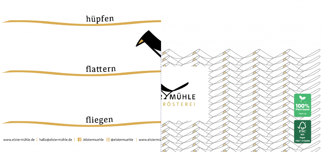
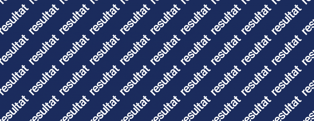
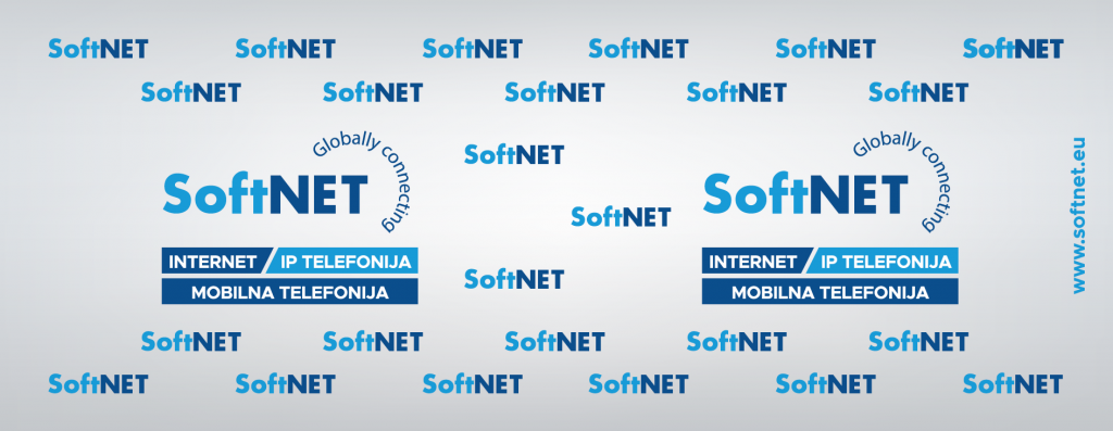
The following designs wanted to make the logo the key element of their design, but not just by having it on each side of the cup. They have been using their logo actively in the design and have placed it several times on the cup.
This means that some of the paper cups have the logo making stripes and others have put their logo in different places in the design to show it as many times as possible.


Colourful Background
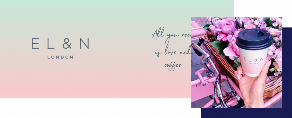
The background of the cups can really change how the cups are being perceived and differentiate from other paper cup designs.
The following designs, that I am going to show you below, are some very illustrative ones. Some of the examples have used fading colours to either highlight the logo of the cup or contrast to the text shown.
The last cup that I have added to the inspiration list is a very colorful design – it is not very often that we make designs that look like that one – but I wanted to shed light on the design since we are able to produce designs like that one as well.
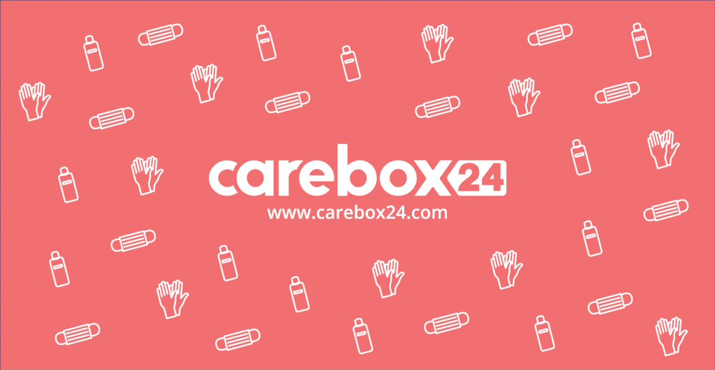
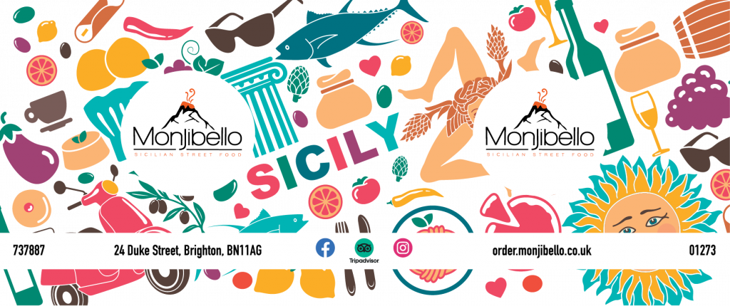
Illustrative Background
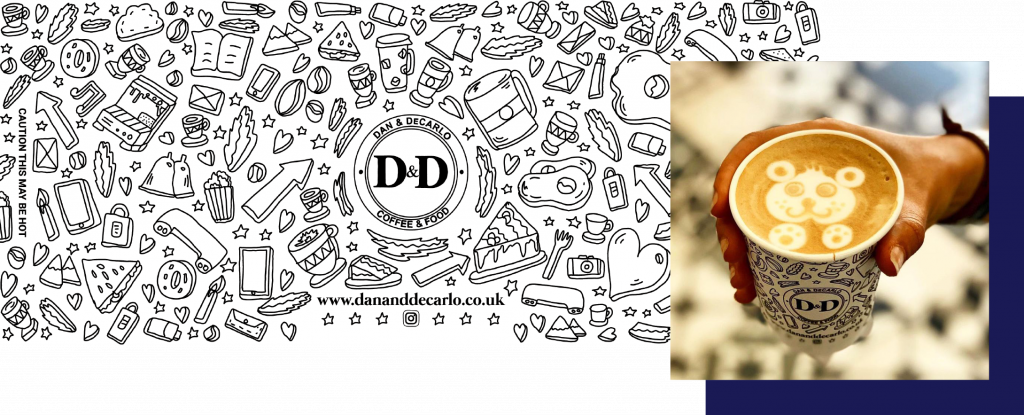
The following category can both be one of the most rewarding design approaches but sometimes it can also go very bad and make the design really confusing.
When the design approach goes wrong it is mainly because of the design showing too many elements, that is not related to the business or not leads to anything.
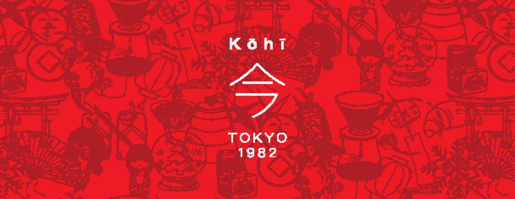
The designs that we are showing down below are both designs that are leading the eye towards the logo, but some of them are also designs that have chosen specific elements that fit for their business.
Striped Background
Let us continue looking at designs including geometrical elements in their design approach. In general, I think that most kinds of designs that adopt geometrical elements in their designs look cool.
The following designs are using stripes, and one thing that is really cool about stripes is that they can create optical illusions about their size and form.
The thing about stripes is that they eventually come in different sizes and forms, which ensures that your design will have your own unique style.
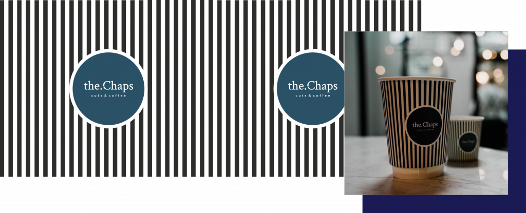
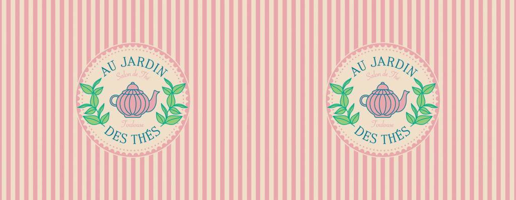
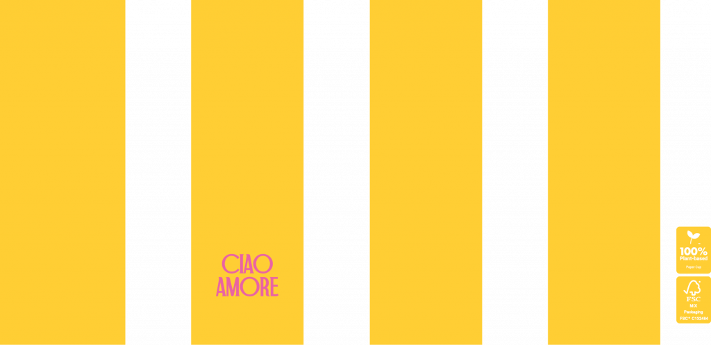
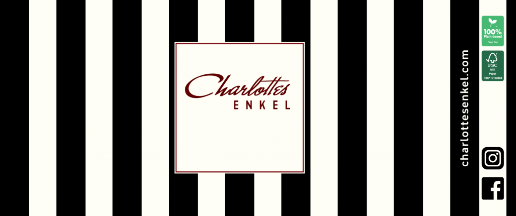
Photo Background
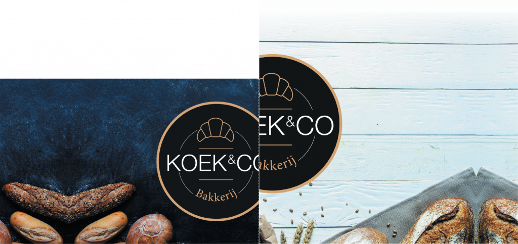
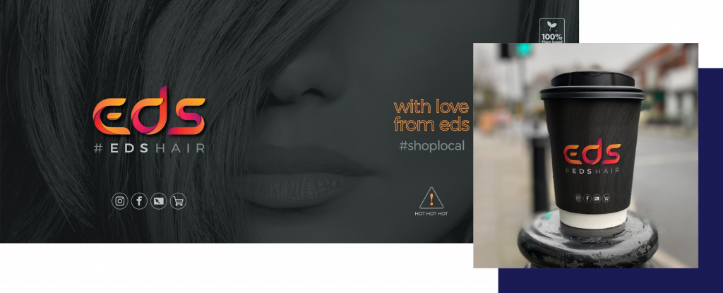
Paper cups are often used for promotion events such as fairs or other public sampling events – and since these companies are trying to sell a physical product, they would like to have it printed on the cups to show what they are selling.
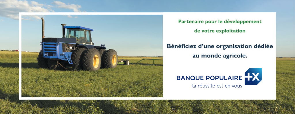
We have collected some different designs using pictures in their prints. The type of businesses differs: Everything from companies selling alcoholic beverages to companies selling tractors.
Some of the designs are also just using pictures in their design as elements or as the background, so the pictures do not have to be the primary objective on the cups.
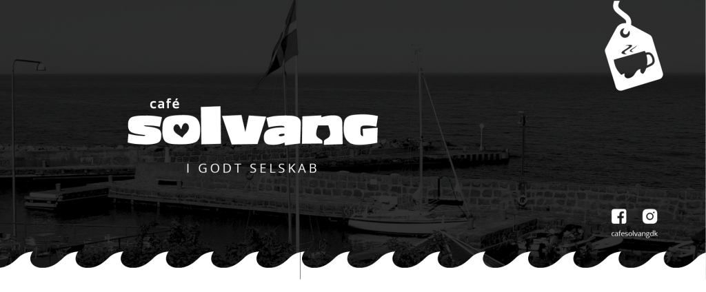

Graphical Designs
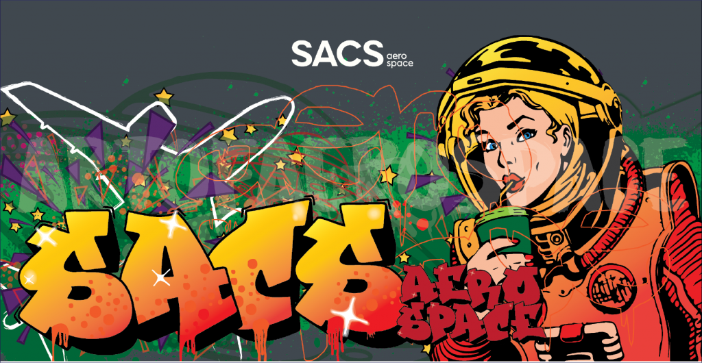
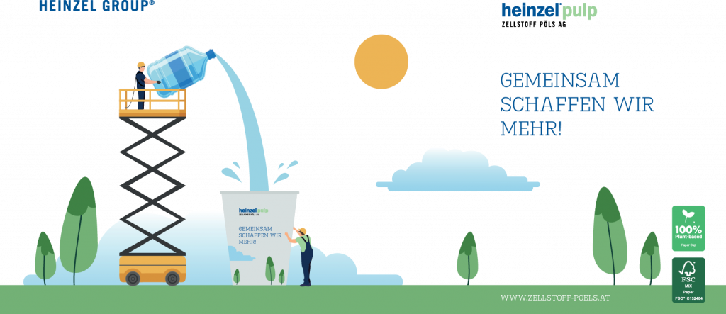
Since the paper cups are printed with full-colour print, it allows us to print almost everything from graphical illustrations to pictures.
This can be a really cool way to show something that is more visually appealing if you prefer that over just having the logo on both sides, for example a picture.
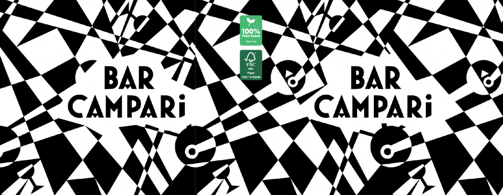
You are also able to go in a totally different direction and use a lot of geometric shapes or graphic elements in the design to catch the customers attention. With this approach you are able to create a unique paper cup.


Stylish Designs
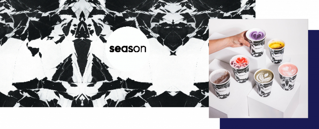
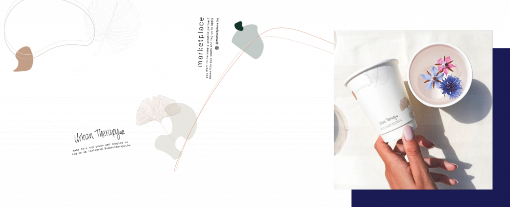
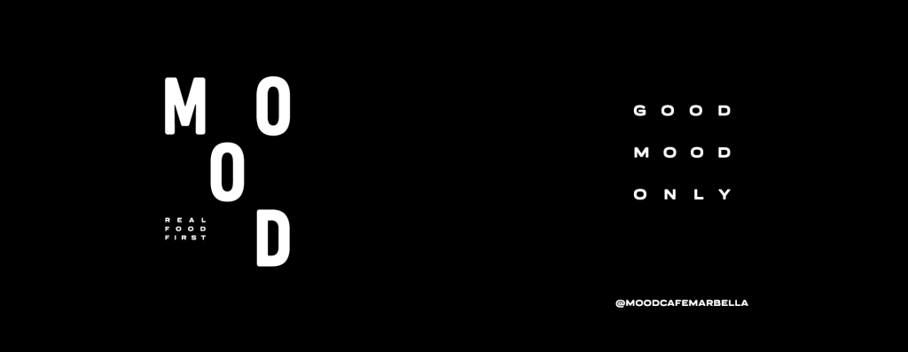
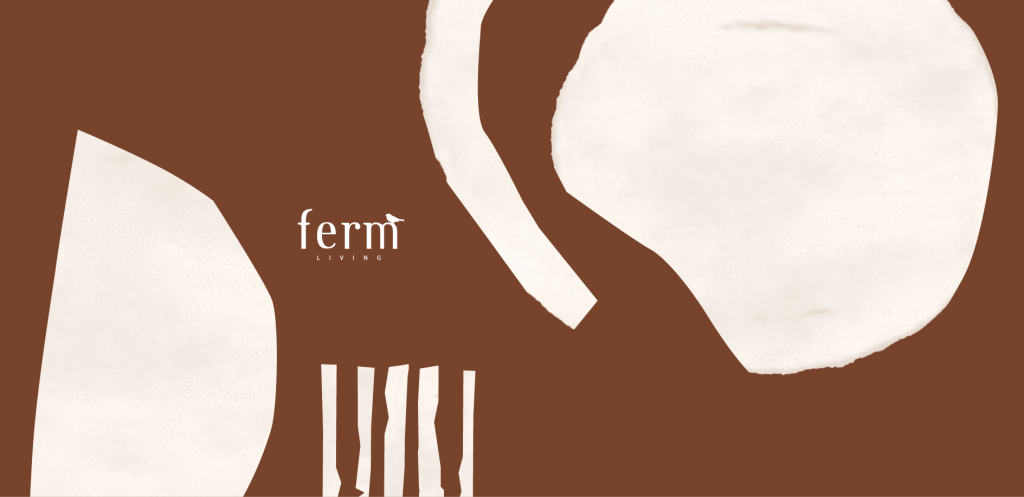
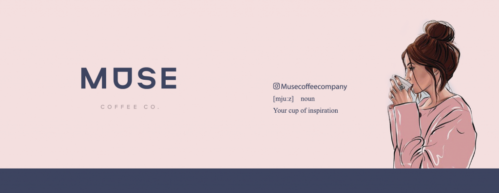
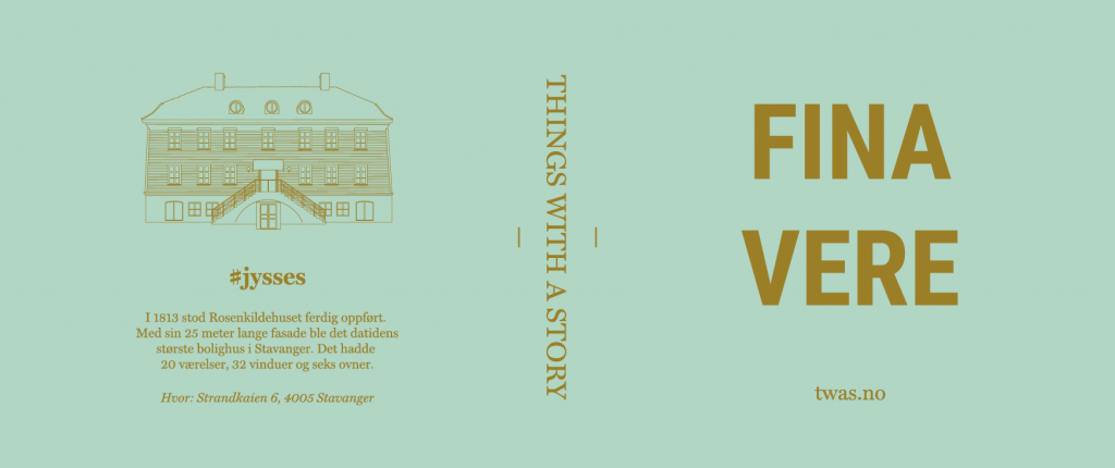
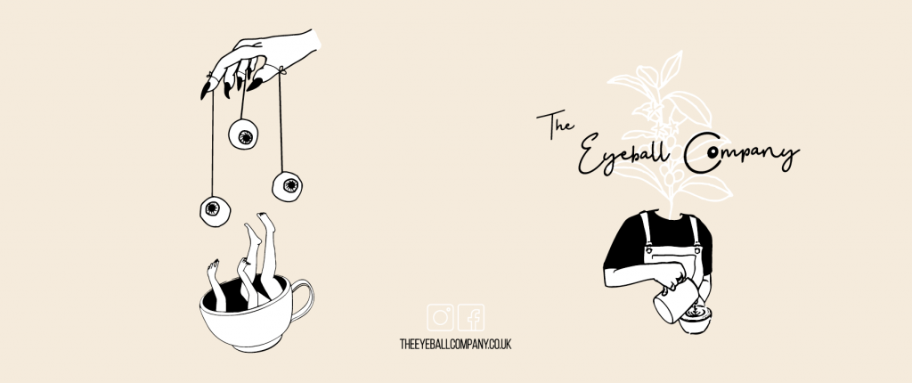
Paper cups do not always have to be colourful to make the design special and eye catching, sometimes the most effective approach is rather simple. When applying simplicity, the designs often turn out stylish.
The following designs are all rather simple, but I think that their different approaches to simplicity shows that there is not only one road to take.
Some of the designs just have small design elements, whereas other designs have a focus on using the logo to make it look simple.
Storytelling Designs
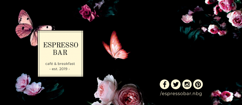
Storytelling is a really important part in branding and especially when creating a brand that other people start talking about when seeing some specific elements or trademarks from your brand.
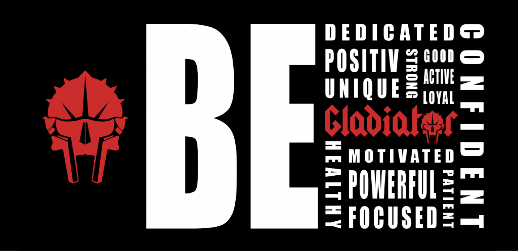
The designs that you will see below have all chosen to highlight something special about their business. One example is a gym business promoting their mentality. Another example are brands promoting their café concept.
Storytelling is not only used in special cases but they can be used in many different scenarios.
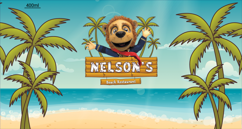
Simple Graphical Designs
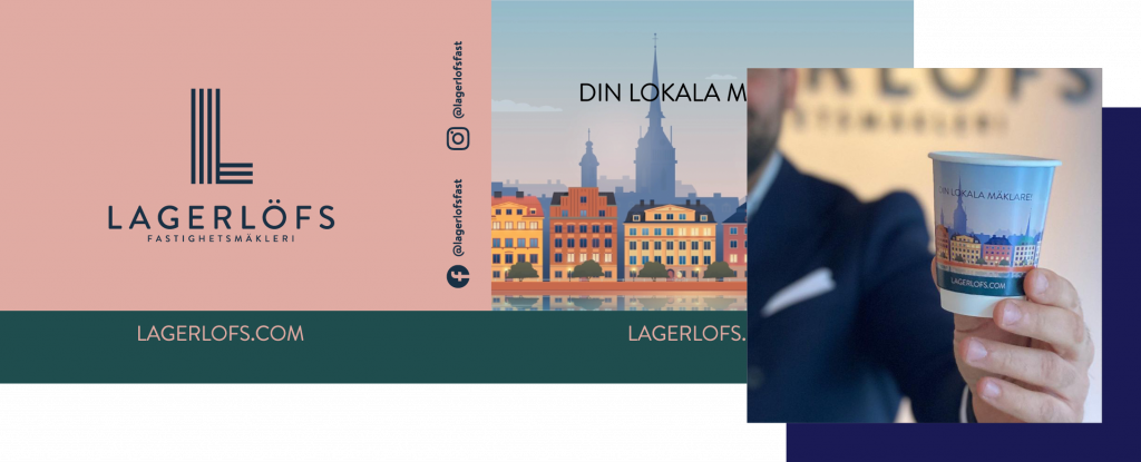
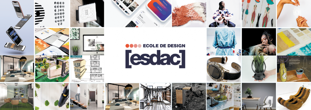
We have just been covering some designs where the elements in it plays a major part (which actually are the most essential part/parts of the design as well).
The following customers/designs have chosen to print the elements as a side objective and are mainly focusing on the logo.
They have added the elements to enhance their message and, of course, also make customers recognize the brand when they see the elements.
I know that our designer, Erik loves to use this very simplific design approach when he is designing something.
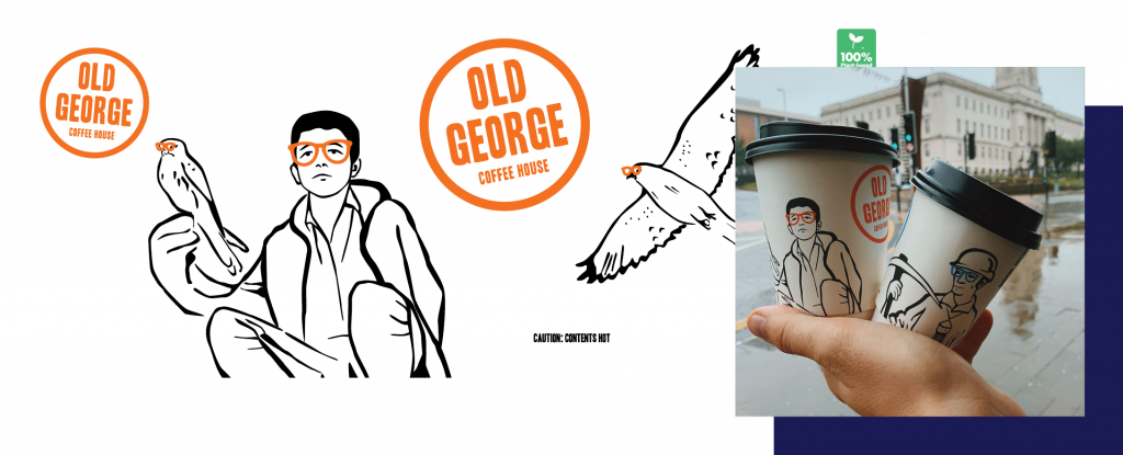
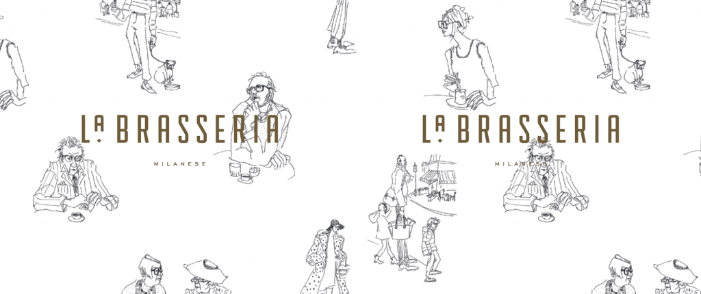
Big Brands Designs
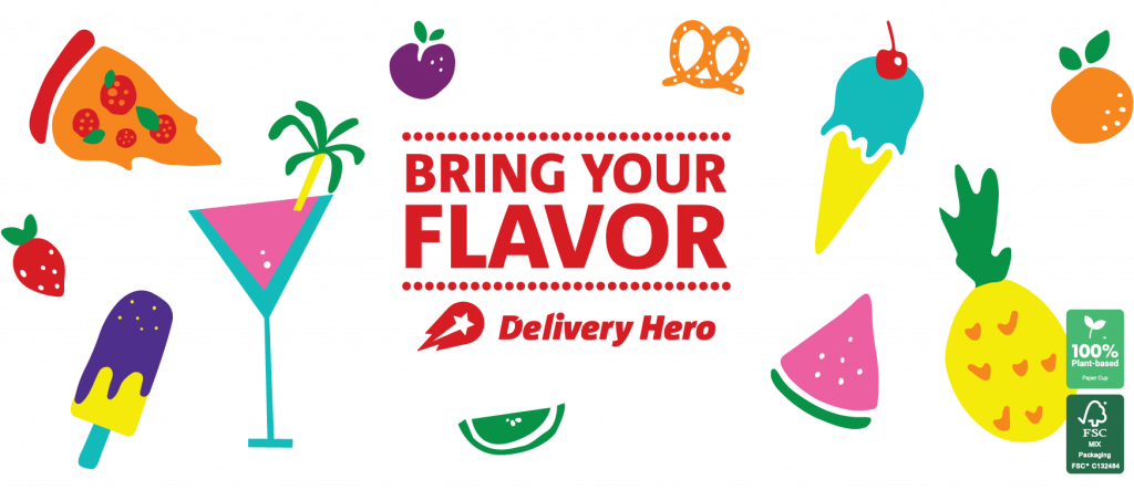
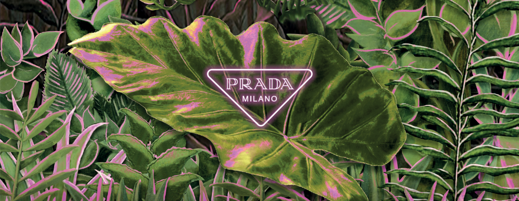
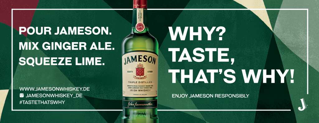
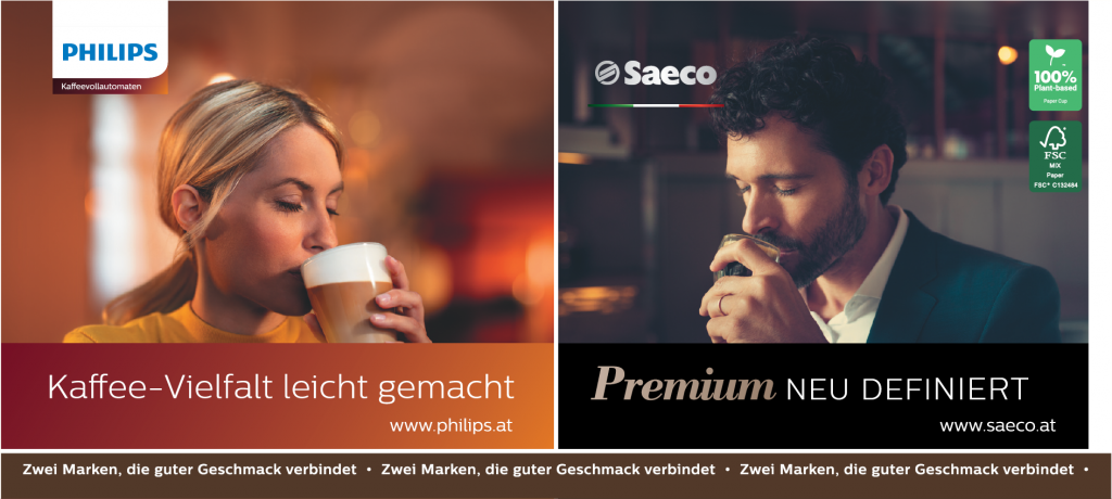
We have also helped several different large brands to brand paper cups – I have added this category to show you how the big brands are doing their designs.
But I also wanted to show that some of the designs are actually really simple, whilst others are really colourful and have a lot of elements.
The designs have in common that they are very consistent in using their brand colours, logo and a specific element if they have that in their brand guide. Let us have a look at the different brand designs.
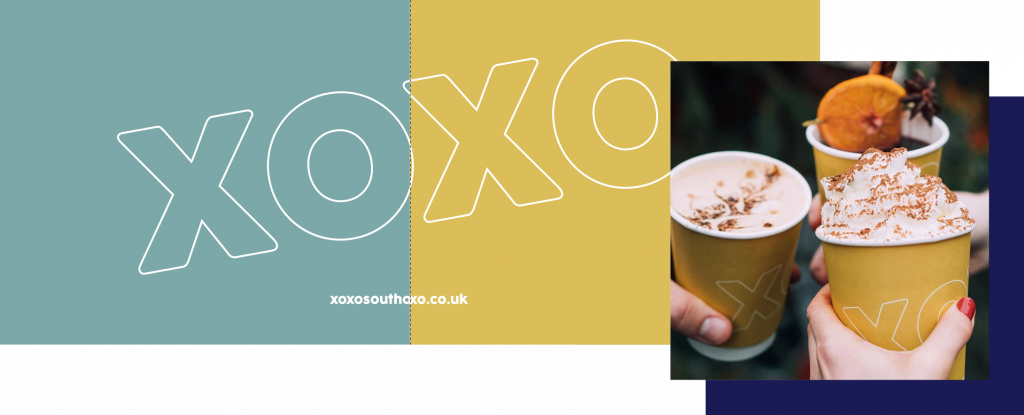
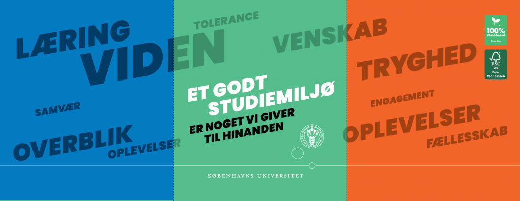
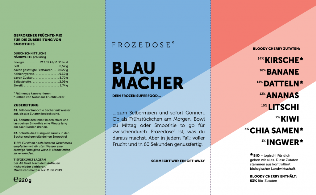
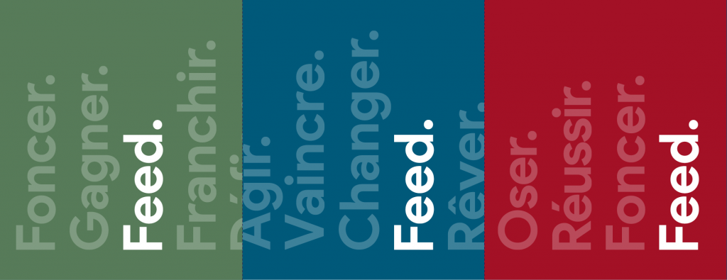
Same Design – Different Colours
To get your message out and heard is not always as easy as it sounds, which is why, it can sometimes make sense to use different background colours to make people see the cups.
This is of course not always the case, sometimes you just want to make it easy for your customer to differentiate between different flavours and you can use the background colours to illustrate that.
Below we have four companies who have used different background colours for the same design to get the attention of the customer.
One of the great things to learn from these designs is that the different background colours are complementary to each other, so they look natural next to each other.
Similar Design – Different Sizes
Finally – the last category!
I want to throw in a last section to show how you can create consistency in your brand and designs across different sizes of the cup.
We have chosen a handful of different brands that have used different approaches to create the consistency needed when using more than one design (for different cup sizes for example).
The key to brand consistency when having different designs is using the same background colour, font or other design elements. There are many ways to spice it up and make it look great.
Let’s have a look at the inspiration.
