12 Best ice cream cup designs
By Steffen Andersen · 15. February 2020
Limepack has helped companies and customers with the design of their custom-made ice cream cups from all over Europe. We have a team of designers that can help anyone with the complete realisation of their design for their to-go packaging for free.
In total, we have made over 300 designs for our customers. For this article, we have selected the 12 designs from which we hope you can get great inspiration for the design of your next ice cream cups. Below, we go through different types of ice cream cups, used by companies in their shops, at fairs, or other events, and explain why their design is unique and inspiring.
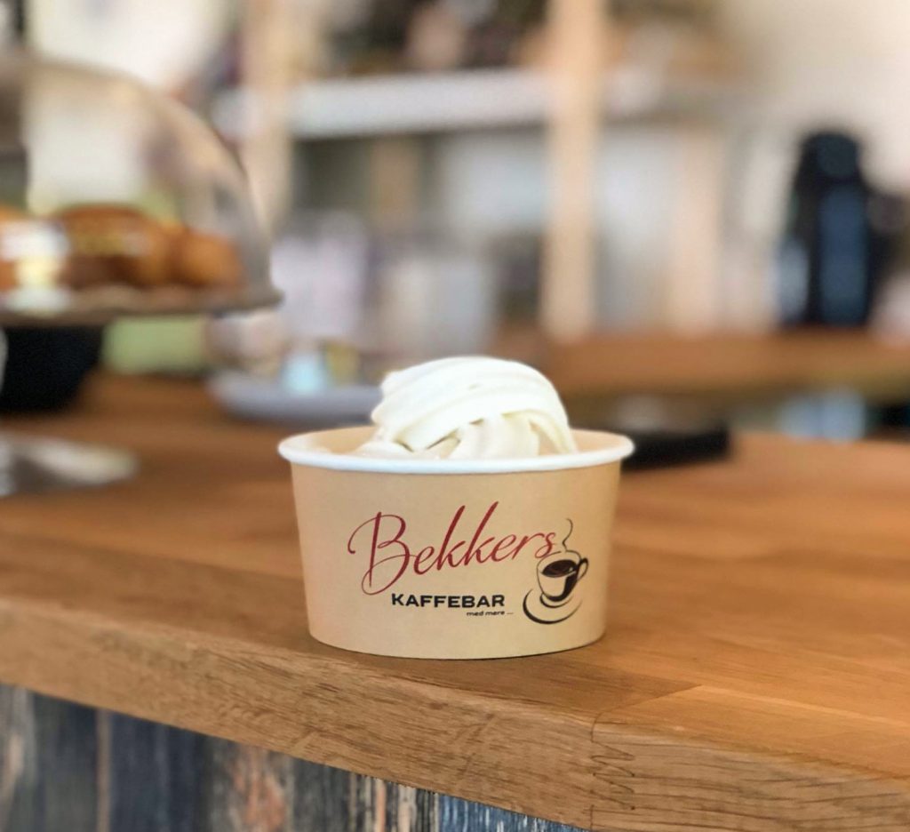
All of our ice cream cups are printed with CMYK colours, which means that the cups can have an unlimited amount of colour without any additional cost.
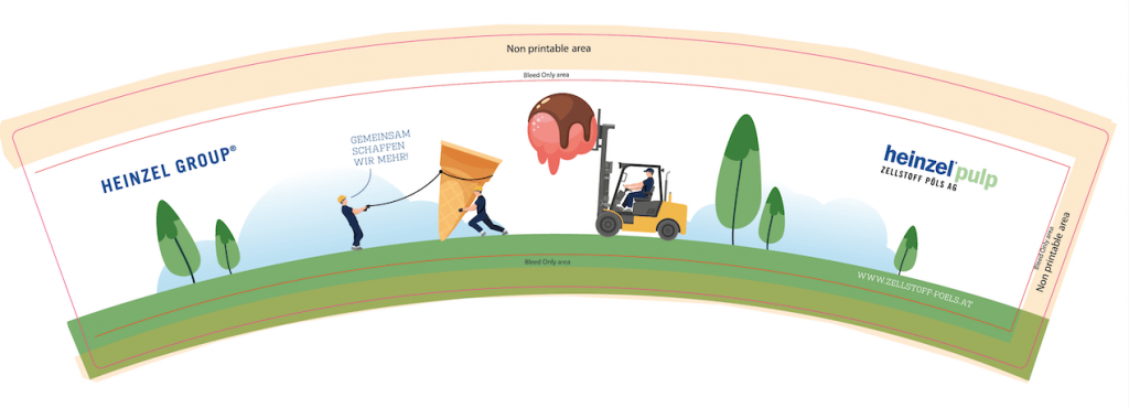
Heinzel Group
The Heinzel group makes machines such as forklifts and works with construction. Their activity is shown on the design of their ice cream cups in an original way as the workers are building the ice cream. The truck is transporting a delicious ice cream and two workers are lifting the cone on which the ice cream should be placed.
The design is simplistic, with a white background colour that contrasts with the illustrations and attracts attention.
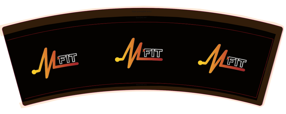
Mfit Studio
Mfit primarily concentrates on healthy snacks for gym lovers, which is why they have gotten printed ice cream cups for their healthy homemade ice cream. The black background colour is a great way to show the contrast with the orange logo. Also, the logo forms a beating pulse, remembering their focus on fitness and healthy living. Finally, the logo is placed on the three faces of the cup so that the logo can be seen from whatever angle.
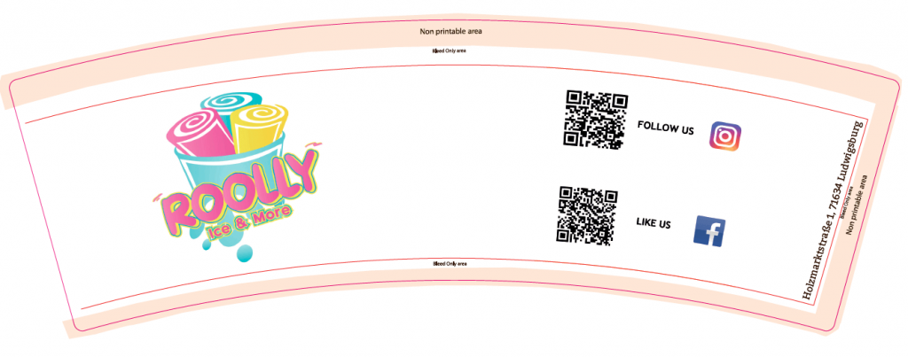
Roolly Ice Cream
Rolly decided to get a rather simple ice cream cup to serve their product to their customers. The left side of the design shows their logo that demonstrates the specificity of Rolly’s products : rolled ice cream. The right side shows their social media.
To have their customers to follow them on their social media, and decided to add two QR codes redirecting their customers to their Instagram and Facebook page. This way, Rolly engaged with its customers in a fun and enjoyable manner.
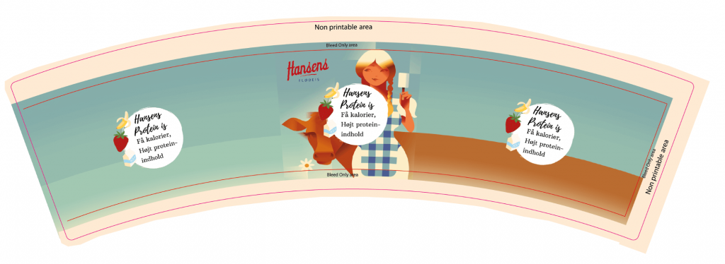
Hansens is
Hansens specializes in ice cream with low calories and high protein intake. The design of their ice cream cups illustrates this idea with the message in the white bubble, and by choosing soft and pastel colours that gives a feeling of tasting organic products.
The first thing which attracts attention is an illustration of a farm girl holding an ice cream, and a cow in the middle of the cup. This design gives the idea that the ice cream is made from local products.
Cucamonga
This design will boost your energy and make you visit this ice cream shop. The design has a shading of warm colours and the plant and the parrot gives an exotic touch. Instantly, this design makes you imagine that you are laying in a sunbed with an ice cream at the beach, making this design very unique.

Reaktor
Reaktor is a company in the technology industry and wanted cups to go to a fair. The design reflects the industry they are in and that evolves all the time, with a futuristic inspiration. This touch of science fiction, with purple, turquoise and pink colours, attracts attention and makes the design unique. Also, their logo has a neon blue colour, highlighting the logo, and giving relief to the design.

Cafe Allfred
Café All Fred has chosen to go for a vintage style for the design of their ice cream cups. The typography they use in the design is classic and elegant, highlighting the quality and authenticity of the product they sell. The pink background adds a touch of modernity and fun, that contrasts very well with the formal typography.
The idea is that Café All Fred offers classic and quality products in an elegant way, but that one can also find a casual atmosphere in the shop.

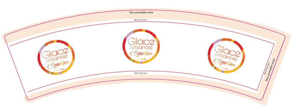
Glace Artisanale L’Ogustine
Glace Artisanale L’Ogustine has chosen a big size of ice cream cups which allows the logo to be really large on the cup. With the shiny logo and colours they have makes it easy for customers to recognize them from a distance.
The logo is set on three sides of the cup which means the customer does not have to turn the cup to be able to see the logo.
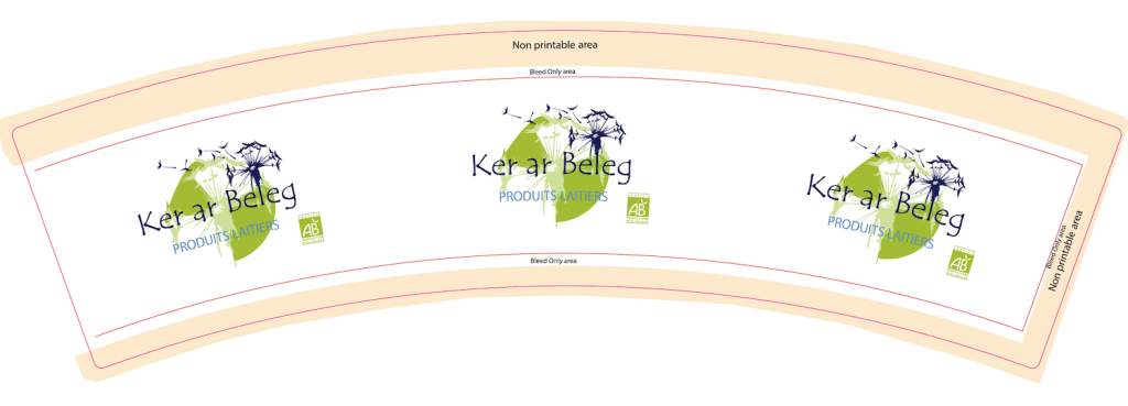
Ker ar beleg
The design on the Ker ar Beleg cups has one purpose which is to show their logo to relevant people. Since they are going to a fair, they needed their packaging to represent their brand simply so that the participants could recognize them and find them easily.
The reason why they have three logos on the cups is that they wanted the holders of the cup to see the logo without having to turn the cup.
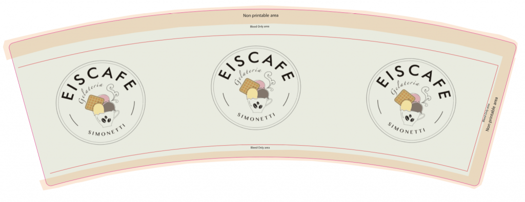
Eiscafe
The Eiscafe has chosen a design where they only wanted their logo on the cups. They only have their logo on them because the logo represents exactly what they are, a coffee shop where you both can get a hot cup of coffee but also an ice cream with different tastes and a Belgian Waffle on top.
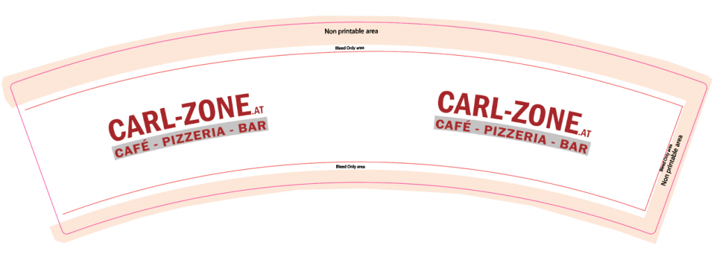
Carl-zone
It might seem that ice cream cups can only be used by ice cream shops, but Carl-zone shows that this is not the whole truth. The Carl-zone design is also not afraid to show that their main product is not ice cream, but also café, drinks and pizza. In the design, they use both their logo showing their name, and their website.
Gelato Vero
Gelato Vero shows and promotes that they are selling traditional and elaborated Italian ice creams both with the flags but also the pink ice cream with chocolate topping. The light blue background is great as it contrasts with the company name, the ice cream cone, and the banner with the flag, which makes those elements stand out.
One can really tell that the ice cream shop has a great sense of matching colours. The blue background also gives that feeling of summer and makes you feel like you are on a holiday near the sea.


