Best Colours to Use for Printed Greaseproof Paper: Expert Recommendations
By Alysse Phily · 18. July 2024
Choosing the best colours to use for printed greaseproof paper can make your food packaging more appealing and memorable.
This article covers the most effective colours and their impact on various foods.
Key Takeaways
- 🖌️ Colour psychology significantly impacts food packaging design, with colours like red, yellow, and green influencing consumer emotions and perceptions.
- Custom printed greaseproof paper offers diverse design options, including various colour choices and printing on white or brown paper, enhancing brand identity and customer attraction.
- Combining colours effectively and using Pantone colours ensures consistency and quality in food packaging, supporting a strong and cohesive brand image.
Understanding Colour Psychology in Food Packaging
 customer shopping in a Supermart
🎨 Colour is integral to food packaging as it attracts the shopper’s attention from afar and leaves a memorable mark.
Packaging experts agree that certain colours can evoke specific emotions and associations, which can significantly impact food presentation.
For example, red and yellow are powerful food colours known to stimulate appetite and evoke taste, making them popular choices for fast food packaging.
Imagine walking into a fast food restaurant and being greeted by the vibrant reds and yellows of the packaging; it instantly makes you feel hungry and excited to eat.
On the other hand, green is often associated with healthiness and eco-friendliness but can sometimes seem unappetizing if overused.
Blue and purple, being cool tones, can also be tricky as they are not naturally associated with food and can be unappetizing if not used properly.
🌟 Grasping these subtleties is vital for crafting compelling food wrap designs that allure customers and amplify the overall food presentation.
Popular Colours for Custom Printed Greaseproof Paper
 greaseproof paper for wrapping burger
Custom printed greaseproof paper offers a variety of benefits, including:
- Visually appealing and memorable packaging with custom greaseproof paper
- A variety of colour options
- The possibility to print on either white or brown paper
We’ll examine some of the commonly used colours in printed greaseproof paper and their influence on branding and customer perception. We’ll delve into red, blue, and green, each offering unique advantages for food packaging.
Red
❤️ Red is a dynamic and bold colour, often associated with excitement, boldness, and hunger. It has the unique ability to increase metabolism and stimulate appetite, making it a favourite among fast food brands.
Incorporating red in your custom printed greaseproof paper can assist in establishing a potent brand identity that draws in and holds customers.
Whether printed on white paper or as an extra colour in your design, red can make your food products stand out and appeal to a broad audience.
Blue
💙 Blue, a colour associated with calmness and trustworthiness, is ideal for health-conscious brands and seafood packaging. Its serene nature can provide a calming effect, making it a suitable choice for businesses aiming to promote a sense of reliability and health.
For health food or seafood-centric brands, blue custom printed greaseproof paper can aid in developing a unique and attractive packaging solution.
Whether used as a primary colour or an extra colour in the design, blue can effectively communicate your brand values and attract health-conscious customers.
Green
💚 Green symbolises health, growth, and nature, making it an excellent choice for eco-friendly and healthy food products. It’s often linked with fresh, organic, and sustainable items, enhancing the perception of your food products as healthy and environmentally friendly.
Incorporating green in your printed greaseproof paper underscores your dedication to sustainability and health, attracting consumers who value these principles.
Whether it’s wrapping a fresh salad or an organic snack, green can help reinforce your brand’s eco-friendly image.
Combining Colours for Maximum Impact
Strategically combining colours can create visually appealing and memorable food packaging designs.
Combining colours like red and yellow to create orange, for instance, can make your food packaging more appetising.
Yet, it’s important to maintain a consistency between colour and product flavour to prevent consumer confusion.
🌈 Using a mix of colours effectively can enhance the visual appeal and memorability of your food wrap designs.
For instance, pairing blue with green can convey a sense of health and trustworthiness, while adding an extra colour like white can signify cleanliness and purity.
These combinations can help create a cohesive and attractive packaging solution that resonates with customers.
Using Pantone Colours for Consistency
Pantone colours are a vital tool for maintaining brand consistency across different printing mediums.
They provide a universal language of colour, ensuring precise colour matching and reducing discrepancies in custom printed greaseproof paper.
Employing Pantone colours offers several benefits:
- Sustaining uniform results across various suppliers and production runs
- Circumventing colour interpretation discrepancies by different individuals or suppliers
- Ensuring consistency for building a strong brand identity
- Delivering a high-quality print that meets your expectations.
Full-Colour Printing vs Single/Double Colours
Full-colour printing offers vibrant and eye-catching designs but generally incurs higher costs compared to single or double colour printing.
The complexity and resources needed for a full-colour print often lead to increased printing expenses.
💡 To cut expenses while maintaining visual charm, consider employing single or double colour printing for logos or key graphics.
Strategic use of colour, such as limiting full-colour printing to necessary elements only, can help balance cost and aesthetics.
Customising Colour Choices for Different Food Types
Customising colour choices for different food types can significantly enhance food packaging and presentation.
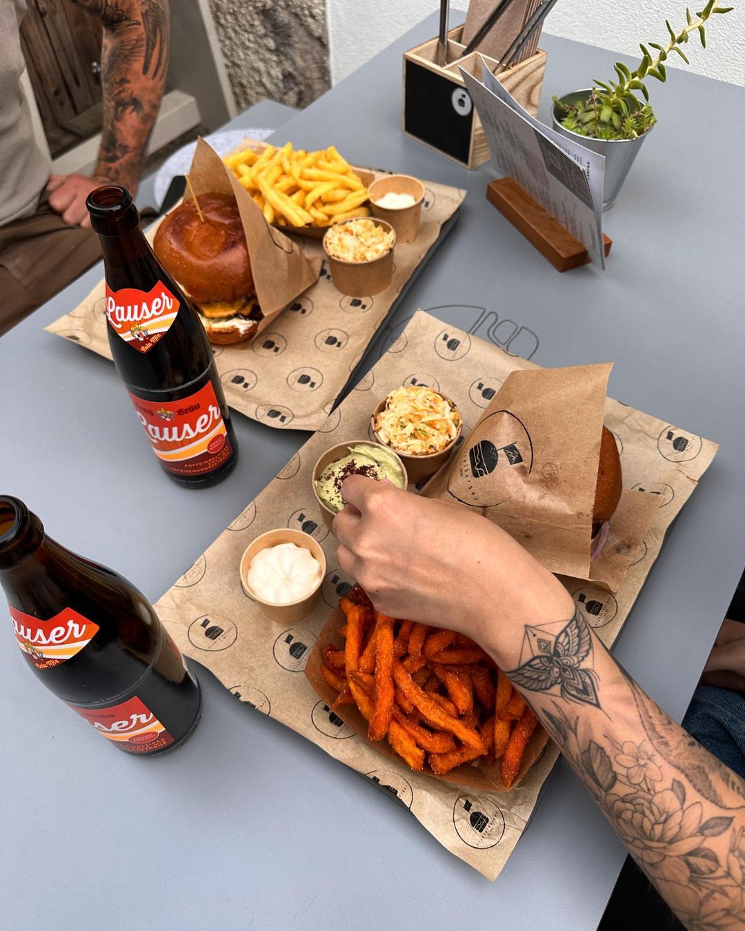
Greaseproof paper, also known as sandwich paper, is ideal for wrapping various foods like sandwiches, burgers, pastries, and more due to its grease-resistant properties.
This makes it a versatile alternative to traditional wrapping paper for food items.
Let’s investigate how to customise colour choices for specific food types such as burgers and fast food, desserts and pastries, and health foods and salads.
Burgers and Fast Food
 © Limepack branded greaseproof paper
Bold and vibrant colours are some of the most effective colours in food packaging, especially for the fast food industry.
Colours like red and yellow are known to evoke excitement and stimulate appetite, making them ideal for burgers and other fast food items.
Applying these colours can draw the attention of younger demographics, generally aged 20-35, and instil a sense of urgency and hunger.
Fast food brands frequently employ these colours to construct a vibrant and attractive packaging solution.
Desserts and Pastries
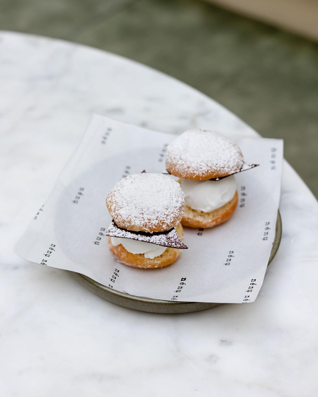
Pastel and warm tones are perfect for dessert and pastry packaging. These colours convey sweetness and indulgence, enhancing the appeal of treats like pastries and sweets.
Pastel tones such as millennial pink, light azure, and creamy mint instil a calming and indulgent vibe, rendering them popular choices for dessert packaging.
These colours remind consumers of spring and blooming flowers, adding an extra layer of charm to the food presentation.
Health Foods and Salads
Earthy and natural colours emphasise health and freshness, making them suitable for health food and salad packaging.
Colours like green and brown highlight natural and organic qualities, enhancing the perception of healthy foods.
The rustic aesthetics of kraft paper is also perfect for enclosing artisanal and handmade products, offering a sturdy and enduring packaging choice that attracts consumers who appreciate organic and handcrafted items.
The Role of Kraft Paper in Colour Selection
Kraft paper’s natural brown hue, derived from unbleached wood pulp, gives it a rustic and eco-friendly appearance.
This makes it an optimal choice for sustainable packaging, as it enhances the product’s eco-friendly profile.
Earth tones and browns, while warm and wholesome, can sometimes make a product appear too common in the specialty food sector.
However, the biodegradability and recyclability of kraft paper make it a preferred choice for businesses committed to sustainability.
Case Studies: Successful Colour Strategies
Branded greaseproof paper can significantly enhance food presentation and reinforce brand identity.
Prestigious brands, including pizza parlours, burger joints, and dessert shops, have successfully used custom-printed greaseproof paper to elevate their packaging.
Businesses can proficiently boost their packaging with personalised greaseproof paper. Here are some benefits of using personalised greaseproof paper:
- It allows for customisation without requiring a large initial investment
- It is a cost-effective option
- It produces vibrant, food-safe packaging
- It aligns with eco-friendly brand values
Using water and vegetable-based inks, these papers are a great option for businesses looking to enhance their packaging with printing plates.
Tips for Designing with Colours in Mind
When crafting custom printed greaseproof paper, contemplate the printing method, readability, brand values, and the location where the paper will be utilised.
Use easy-to-read, bold fonts to ensure the company name stands out.
Colours should have a meaning for the business and reflect it, ensuring they are visually appealing and readable.
For on-the-go food items in takeaway boxes, designs should be bold with prominently placed logos, while postal treats should enhance the unboxing experience.
Summary
In the world of food packaging, colour is a powerful tool that can significantly influence consumer behaviour and perceptions.
From understanding colour psychology to using Pantone colours for consistency, and customising colour choices for different food types, there are numerous strategies to enhance your food presentation and brand identity.
🌟 By applying these expert recommendations, you can create visually appealing and memorable packaging that resonates with your customers. Embrace the power of colour and make your food products stand out in the competitive market.
Frequently Asked Questions
Why is colour important in food packaging?
Colour is important in food packaging as it helps attract customers, evoke emotions, and create memorable experiences.
What are the benefits of using Pantone colours?
Using Pantone colours ensures precise colour matching and consistency across different printing mediums, which is essential for maintaining brand identity.
How can I minimise printing costs while maintaining visual appeal?
To minimise printing costs while maintaining visual appeal, consider using single or double colour printing for logos or essential graphics and limit full-colour printing to necessary elements. This can help reduce costs without compromising visual appeal.
Which colours are best for fast food packaging?
For fast food packaging, bold and vibrant colours like red and yellow are best as they evoke excitement and stimulate appetite.
What colours are suitable for health food packaging?
Health food packaging should use earthy and natural colours like green and brown to emphasise health and freshness. Green and brown are suitable choices for health food packaging.

