Consistency regardless of size
By Rebecca O'Connor · 11. January 2022
When designing packaging, and in general making designs that are going to be used across different products or platforms, there is nothing no more important than consistency in the design.
In the following post, I am going to use paper cups as an example, since we are helping a lot of different businesses with branded paper cups in multiple sizes.
There are many ways of creating consistency across different sizes, and we have chosen to showcase four different approaches.
When talking about design approaches in general, there are no right or wrong but there are of course some rules that will give you that extra consistency that we of course want in our design.
You might already be thinking, what is it that can create these different kinds of consistency that I am talking about?
I will give you a little hint, the logo is not always the only way to do it.
Well let’s dig into the first example that we have from Rifugio Italia, and then we can see how they did it.
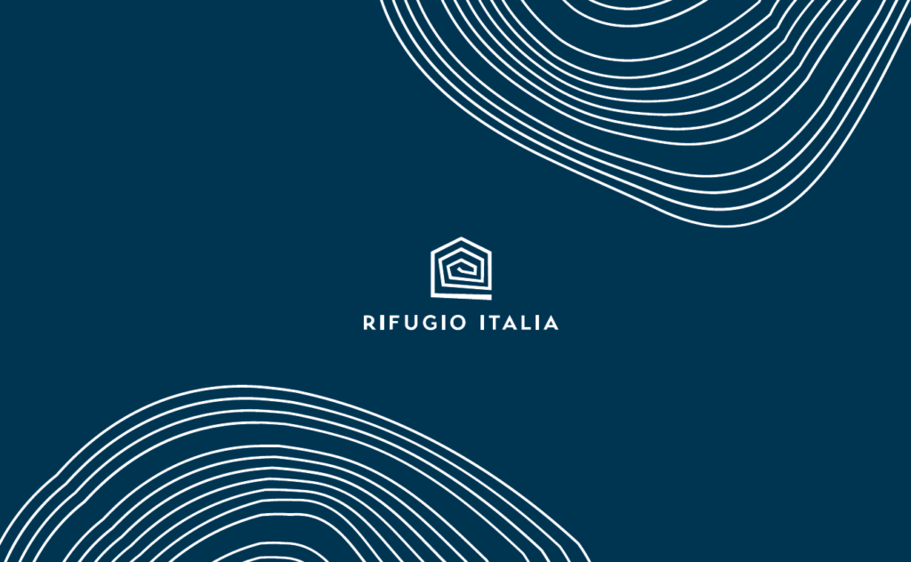
Rifugio Italia
Rifugio Italia is an Italian coffee shop that offers four different sizes for their coffee, tea, and etc.
When making the design for their different sizes, they have chosen the “easy” way by having the same design on all of their sizes.
This is also what the majority of all the companies that we help with different sizes of paper cups choose to do, because you don’t have to both make designs that match each other across the sizes and differentiate the designs.
Even though this might be considered the “easy” and simple way to get consistency across multiple sizes. But no matter what it does the job and there is no way that your customers will confuse your brand with someone else.
115 ml

240 ml

350 ml

450 ml
Golden Soul
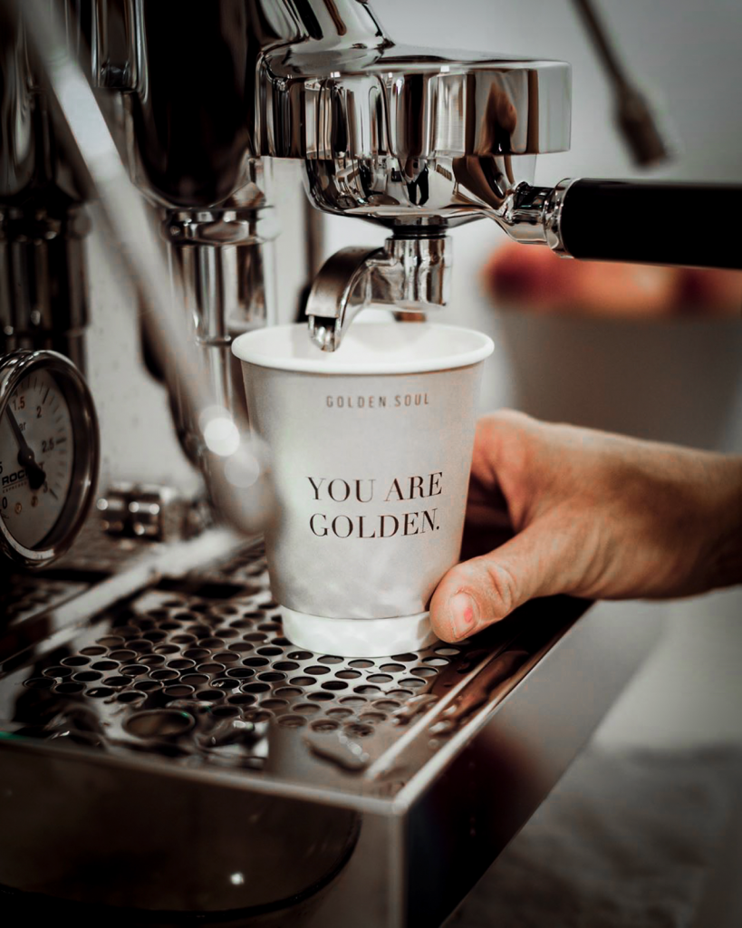
Golden Soul is a clothing and jewellery store in Austria that also offers their customers to buy a cup of coffee.
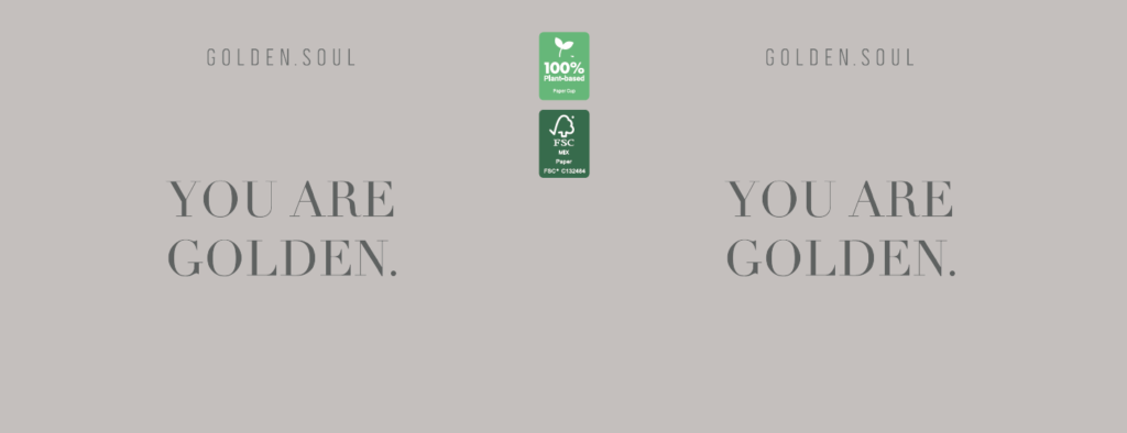
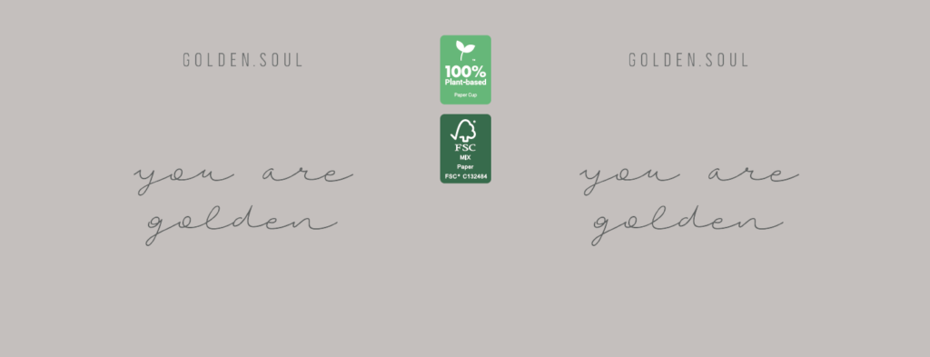
They wanted to get a very simple and clean design for their cups, but they have still chosen to use different fonts on their different sizes – to make the designs differ from each other.
Consistency is not always just having the same design across all platforms, it can also just be using the same key🔑 colour as the background, which is what Golden Soul are using as their primary way to create consistency.
It is of course not the only part that has consistently in both of their designs, they also have their logo “GOLDEN SOUL” on both sides of the cups in the top.
But when we are talking about consistency, we are actually focusing on the parts that make the people seeing the designs link the cups together, so people think that the cups come from the same store – and in this case this is the grey background colour.
Have a look at the Golden Soul two sizes of paper cups!
240 ml
350 ml
Koek&Co
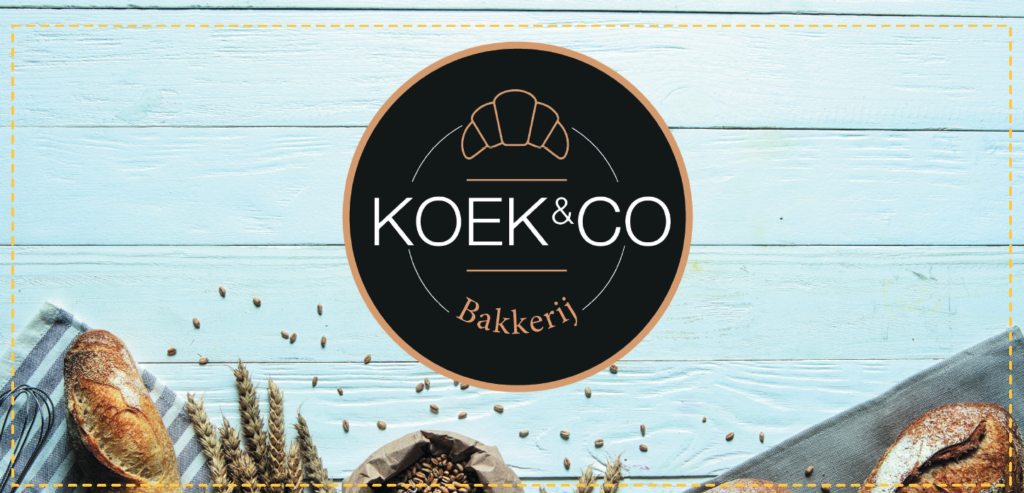
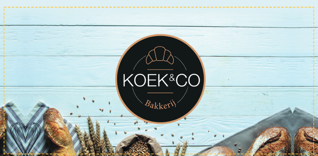
Koek&Co is a bakery in the Netherlands making different kinds of breads and cakes.
They are really great at taking pictures with their products in them and they wanted to showcase their products on the cups.
Which resulted in two different designs across their three sizes of cups. In the two designs they have used different pictures with two different kinds of backgrounds.
They have been consistent in having their logo in the middle of the cup and since you can also see bread in both of the designs, the design doesn’t seem that different.
The following examples are a good way of showing how to have different backgrounds and elements, but having a design where the customer clearly can see that the paper cups are from the same company.
240 ml

350 ml
450 ml
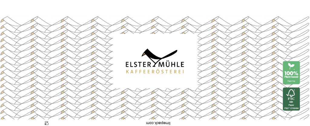
Elstermühle
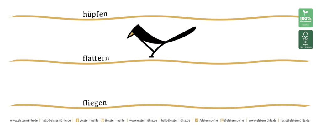
Elstermühle is a German Coffee roastery, who needed cups for their coffee and fairs they attend across Germany.
They have gotten two sizes of cups, so they have one for a normal cup of black coffee and a cup for cappuccino.
In their normal brand they are really good at differentiating their different designs for the coffee bags and other printed articles they have made.
It was no surprise that they of course wanted to keep this approach in their paper cups.
In their designs they have chosen to make the Bird in their logo, the main thing that connects the two designs with each other.
The background is of course white – but since there are so many elements in the designs, they kind of “hide” the white background.
I think the way Elstermühle designed their paper cups is a good way to show how consistency can be made with using very few of the same elements – but just keeping the colours clean and making one element stand out across both cups.
240 ml
350 ml
